this is more of a open question/challenge…
A lot of products, parts or even architecture have features where holes are arranged in some kind of grid. Think of venting holes, speaker grill, showerheads…
I find it very hard to cover non-rectangular shapes with nicely spaced points, a nice edge and some kind of order.
From my experience there’s no “perfect” grid. You can’t fit a square into a round hole. Something’s gotta give somewhere. It’s the question of customer’s personal aesthetics choice.
If customer doesn’t already know what he wants, we present him with a few options. Usually 2-3 (obviously having our own convenience in mind). If he still doesn’t like it, we explain why it can’t be done “perfectly” or present him with the worse aesthetically looking alternative, so he agrees to the one out of the first set of choices.
Having said that, we’re not a design company and we can’t be spending engineering time on artsy fartsy stuff.
To comment on your examples - all three perforation options are done with a different ruleset (I guess it depended on the fill shape), so which one is perfect?.. More to say, all three look handmade too.
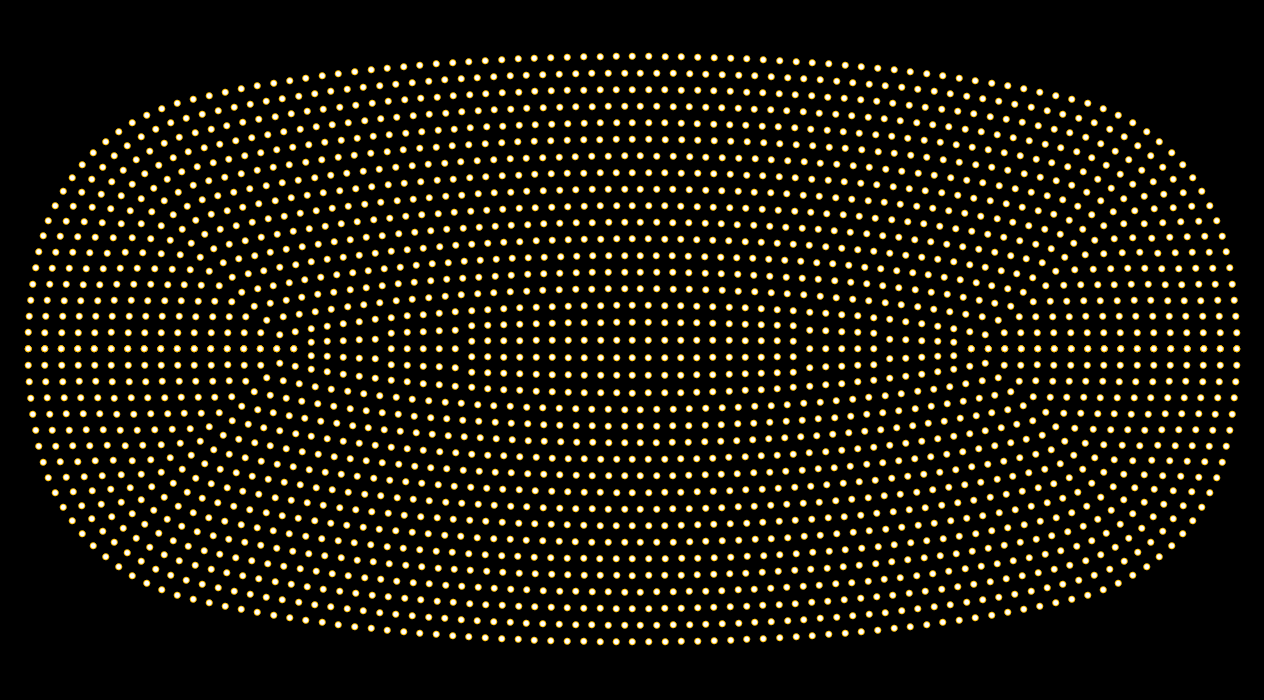
my approach would be similar to what you see in the B&O images, taking a curve that is unreleated to the shape so that you create some ‘tension’ in the appearance:
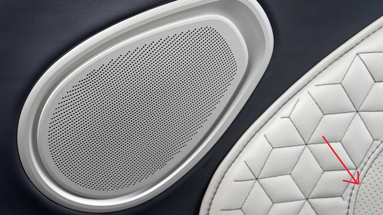
Some years back I made a lot of perforation patterns for Volkswagen/Bugatti and it indeed has always turned out to be a difficult job. I think an ellipse is a rather simple example because you can break it down to 4 edges, two of them equally sized, which makes it rather easy to fill up. Reality isn’t like this. The B&O example and the speaker below is by far the best, because from my experience the most important aspect is eye floating (don’t know if this translate right). Basically you don’t want any stop in the pattern. Therefore a perforation based on curves almost always yields best results. You always read the perforation as a dotted curve. A relaxed mesh returns equally spaced points, but has many directions, indicating something is not working right. jagged edges are usually more acceptable, if it follows some sort of regularity.
There are many possible ways to relax these distributions – beyond just treating edges as springs.
As several people have pointed out, the flow of the curves can be more important than the spacing, so sometimes it makes sense to use bending along grid lines to keep them smooth.
Also, making any changes in edge length more gradual across the grid can help – so equalising concurrent segments along the grid directions.
The hardest part is often selecting the right topology. Internal irregular vertices tend to draw the eye, which we often want to avoid.
However, if we don’t have any internal valence 2 or 3 vertices, to meet a smooth boundary curve we need to either chop some grid cells diagonally at the boundary, or have some valence 2 corners, which tend to cause some bunching up around them.
If cutting cells diagonally, there are then various ways to treat the relaxation differently at the boundary to get the spacing nice.
Actually this picture hints a good trick when edges can’t be achieved well. You truncate or encapsulate the pattern with a visual gap or extrusion of similar diameter. Building a fake component-separation always increases the visual quality for free.
One advantage of using a triangular grid instead of quads is that you can turn corners with a smaller angle in the regular grid (multiples of 60 degrees instead of 90, or 30 instead of 45 if allowing half cells), so when relaxing these corners onto a smoothly curved boundary they cause less bunching and distortion.