The Rhino WIPValue Pickergrasshopper component is now ready for testing in 9.0.25286.00305 and above.
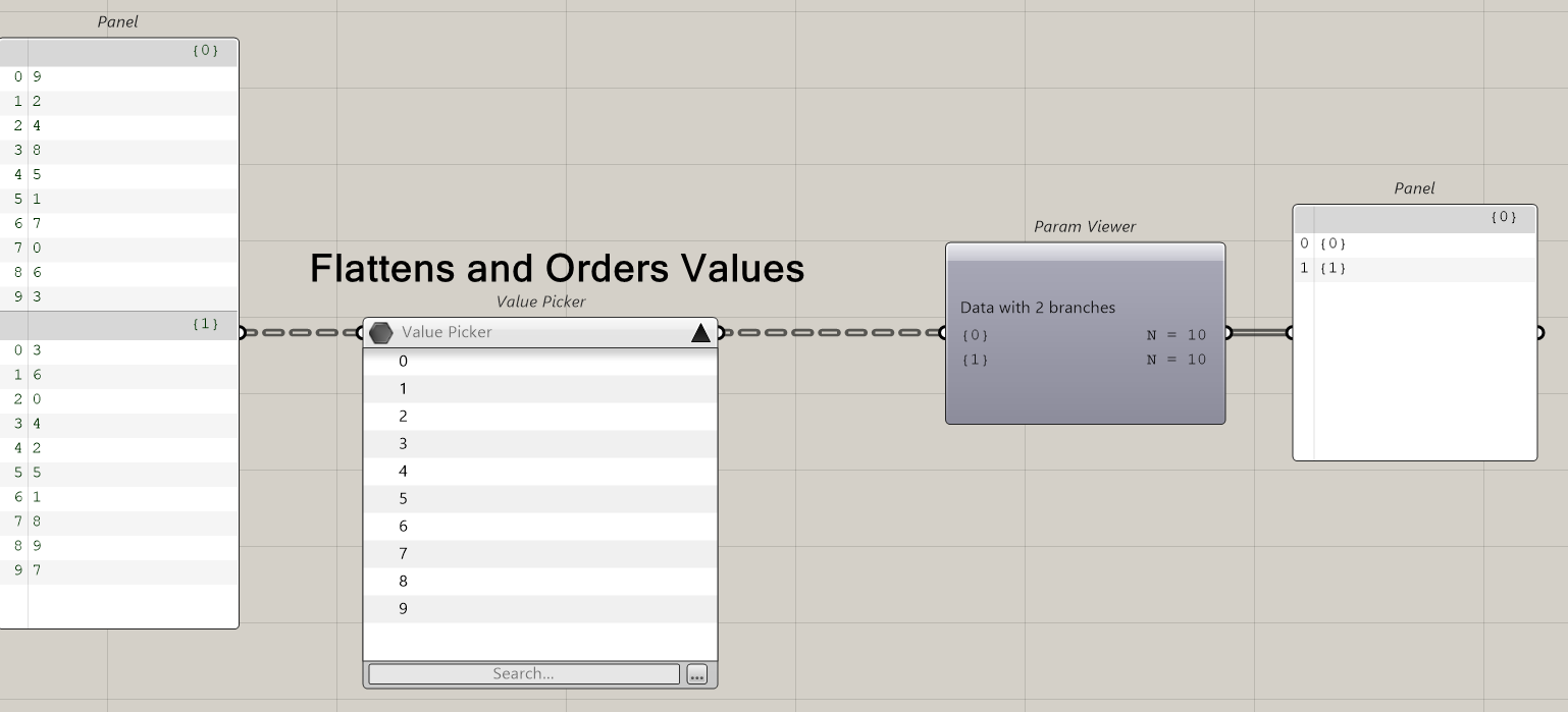
This new Value Picker component is for anyone in Grasshopper that needs to find, select and filter from a long list of values. This component which allows one or more items to be selected from a variable length list. Previously this component was only available in Rhino.inside.Revit..
After you search the list will be reduced (in default mode). Are you looking for an option for the entire list to be visible at that point, vs dragging down the bottom of the dialog?
Yep, something like that. Kind of auto adjustment to the list length. It could help to see, at first glance, with how many items I am dealing with. Or, maybe, list length displayed at the upper right corner (just thinking out loud).
In the first post Japhy said “…from a LONG list of values”. I presume he means a list potentially far longer than can be displayed on any screen. How would you handle that?
The file path is too long and for my purpose it would be nice if the value picker would ignore the file path which is used in the query directory component. Or in other words the value picker component would benefit from an option to display just the file name and extension instead of a full file path.
Maybe in the Layout options besides ‘List’ and ‘Details’ we could have a ‘Compact’ option?
Some prep before entering the value picker is required in certain workflows. The cleaner output from the file path might need to come from that component.
I think that would require a File Path Data Type, where the picker would know ‘hey this is a path, only show the file name’. In the query directory component we know that Files is always going to be a path.
What rule is applied to display the content when the panel/component width is reduced?
I think file paths could always be split at backslashes instead of splitting somewhere sort of randomly within the filepath. This is how I would expect the file paths to be displayed when the file path is longer than what can be shown:
C:\Users\user\OneDrive - work AG\Documents\hardware\washer_m6_10.8x1.5.3dm ...\user\OneDrive - work AG\Documents\hardware\washer_m6_10.8x1.5.3dm ...\OneDrive - work AG\Documents\hardware\washer_m6_10.8x1.5.3dm ...\Documents\hardware\washer_m6_10.8x1.5.3dm ...\hardware\washer_m6_10.8x1.5.3dm ...\washer_m6_10.8x1.5.3dm
With or without C: at the beginning I don’t care.
But the way it is now is difficult to read. Not all file names are shown with the same depth.
Instead of show as much as possible I think it would be better to clip the file all file names like the shortest file name is clipped. In the above screenshot that would mean that \Documents is not shown.
Very nice. I would add an option to select multiple items from the dialog box. Also a selection by index would be a time saver, especially when combined with a search. Same for multiple search queries and search intersections with logical operations
*7 OR ?5 #finds all items ending in 7 and all two character items ending in 5
*Apple* AND ing$ #finds all values containing apple with verbs eg. Apple picking
A more useful example would be *FolderA* OR *FolderB* AND NOT .3dmbak$ find all items in FolderA or FolderB but not with extension .3dmbak