I’m an avid user of the popup menu and appreciate having my most commonly used tools a button press away. I basically moved all my most commonly used tools to the popup menu, and reserve shortcuts and aliases for operations, transformations, deformations, etc.
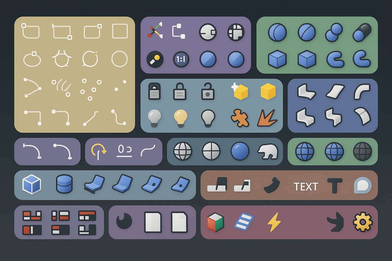
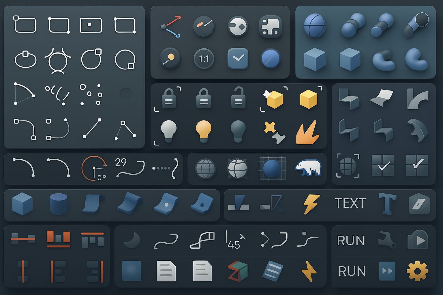
I propose a color-grouping system to make it easier to spot icons at a glance. Basically, give the user the ability to cluster icons together in groups by color. I believe this will help build visual muscle memory and makes it easier to find what you’re looking for. The Rhino 9 color icons will go a long way towards this, but sometimes you want to group together unrelated icons. That’s what the groups are for.
I played around with ai and got it to generate a bunch of mockups for inspiration – it made plenty mistakes, but I think you get the idea. There are many stylistic ways to go about this, and I think you can make something really great here!


A great addition to this would be a “popup builder” – a dedicated workspace akin to the SVG Editor where users can build groups and organize icons. In all honesty the current popup menu-related experience is pretty user-unfriendly. I have zero coding experience otherwise I would attempt to build some kind of plugin myself, but I think it would be great to have as part of core Rhino.