Found her clothes. Hence the iron.
I agree with you, the colors of those icons, Barbie style are unwatchable! It seems like we don’t use Rhino anymore (we all got used to the interface with the blue icons, not “Smurf” colored, candy pink, ecc.).
I hope they do something serious, a more pleasant and less “harlequin” palette.
2 Likes
Because of the icon colors?
that’s not just you, I’ve noticed that one too.
I agree that icon needs some love. But I think icons that need to be reworked deserve a new topic.
Did you ever try out the color settings in Windows to adjust for color blindness? I wonder how effective that is.
1 Like
These washed-out icons with lime green are super bad for my eyes. They are both distracting and difficult to read. As a colour-blind person I see the “Split” and “Trim” icons blinking due to the use of colour combination.
2 Likes
Exactly. It seems to have a different, non-traditional Rhinoceros, which we were all used to for several years. Those pastel colors are unwatchable!
I tried the Windows settings for colour-blind people, but they bump the red too much and red shades get crushed by a lot.
I see 4 main issues with the new icons in Rhino 9 WIP:
- Washed-out colours;
- Lack of solid black outlines;
- Replacing blue objects with lime green objects;
- “Split” and “Trim” icons use colour combination that causes blinking to my eyes.
To fix issue #4, the cutting blade in these icons must be some other dark colour. Currently, it’s a shade of green which is near the limit of my vision, so from a distance I see it like both green and red (blinking and changing between both colours constantly). This particular green (RGB 118, 184, 19) consists much more red than blue, so my eyes get confused. From close-up I see it as green, from 60-80 cm I see it as red. From 40-50 cm it’s blinking.
This negative effect is also caused by any other icon consisting red and green next to each other, such like the “Show edges” icon. I see nearly black pixels between the red and green from a distance, even though there is no black when I open the icon in a graphics program and zoom it in several times.


1 Like
I find this approach as the best solution for all users. Individual layers for the main elements included in the icons.
Or at least “McNeel” should provide a set of SVG icons, with up to 3-4 separate SVG files per icon. One SVG must include only the outline mask, a 2nd SVG file must include the main object(s), a 3rd SVG file much include the cecondary object(s). That will make customization of the icons much easier.


I don’t have much problem with my eyes, but the change of colors and reduction in contrast seems meaningless to me.
When seeing how badly this affects the color-blind it seems like a less than smart move.
//Rolf
1 Like
It’s really interesting how different we all experience the GUI. The muted, lighter, and more pastel color scheme with thin and not fully black outlines are much better for my brain. So there’s probably no outcome where one icon scheme will work for everyone, hence having user defined or dynamic/parametric icon schemes would be great (e.g. like Grasshopper 2). Which seems like it should be possible with the new SVG icons, maybe? One might add a menu to the appearance settings:
3 Likes
in the mac version before the big unification hick up with v8, there was a rather smart tendency to calm down the UI, maybe it was not perfect yet but all of it got completely binned anyway.
even the monochromatic icons are much worse in v8
here v7 slightly weak but still better than v8

vs a shouting mess of too much contrast (ok contrast is good but when it starts burning then its too much)

sure that might be a bit nitpicky now but there is just a general mess when i look at the icons, and that does not only hurt because i am graphic designer either but it simply is not modern in any regards.
to distinguish for instance the icon sketch above on the right upper parts and comparing it with for instance array seen here below, all these squares make zero sense

we dont have squares anymore, i believe the round points are by standard now?, the distances of the squares are also too narrow, i would just rework the entire section. there sure is a lot to take over but generally it just needs a major overhaul and not just adding a few fancy rainbow colours to distract.
working with all bells and whistles constantly ringing, is maybe just not ideal.
also is @marika_almgren an actual designer? i certainly dont want to flush down her efforts, but hiring a full specked graphic designer might be a good idea?
1 Like
I have to disagree… My old eyes like the contrast.
2 Likes
I like high contrast as well.
It should be adjustable, should work for all then.
Keep in mind that contrast is all bout perceived light intensity as we have adaptable eyes.
Man-splaining follows:
(iris=aperture) the perceived contrast depends on both lumen from the monitor, it’s actual black level, it’s gamma settings and the surrounding light at workstation.
We have all tried to squint on a laptop screen out in the sun because everything is too dim and thus has too low contrast, only to go inside and experience the same but now too bright image when sitting on the bed in a dark room late at night. Nothing changed but our eyes and our perception because of our surroundings. Point is: What I experience as too high contrast where I am right now might be too dim for you where you are right now, even if nothing changes to the image emitted.
And how can this be solved you might ask?
So optimally I would add a contrast/brightness slider together with a saturation slider for the Rhino GUI. One that does not affect the SVG’s but affects the bitmaps the GUI generates from all these SVG’s. This should not be too difficult to implement and could also swap all darker than 97% dark pixels to bright and visa versa to accommodate one SVG to support both bright and dark modes. This swapping should not happen in the RGB colorspace but rather in the HSL colorspace so color isn’t affected.
Obviously it is a massive thing to get this right, but it shouldn’t be too difficult to implement if the GUI is programmed correctly. I presume there is already a pipeline hooked up to the icon scaling feature, and this is where I would implement it (theoretically).
7 Likes
Ctrl+Win+C does nothing on my Windows 10 and Rhino 7 or Rhino 8.
Also, the goal is getting a higher contrast (no washed-out icons), saturated colours (don’t replace blue with lime green, too) and solid black outlines.
Note that low-contrast outlines makes it more difficult for the colour-blind people to distinguish the icons, because we see a vastly reduced colour palette than the people with normal vision. To further make it worse, nearby colours also change the perception of the main colour.
For example, for nearly two decades I thought that the “Save” icon is red, but after opening it into a graphics program recently I figured out that it’s actually green. ![]()
On the other hand, the “Select meshes” icon is yellow, but I see it as green, because it has some extra black lines inside that fool my eyes.
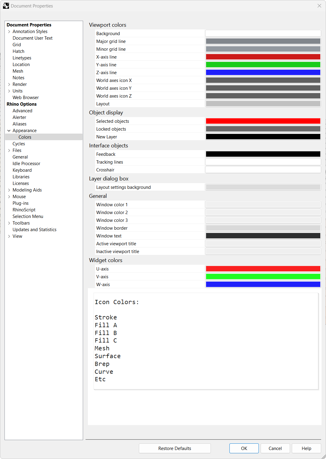
Another reason for my request to include a slider for modifying the SVG’s darkness/contrast of the outlines is the use of RGB 190, 190, 190 as a background colour for my tabs (“Window solor 1” located in Rhino options > Appearance > Colors). Low-contrast outlines look terrible with that background.

what I’m hearing here:
No matter what McNeel does to icons, someone will truly hate it, and the only solution that may possibly have a chance of working and making anyone happy is to build a readily accessible set of controls that lets the user customize buton colors to their liking
Am I hearing that correctly?
14 Likes
An alternative would be several sets of icons with user being able to select their preferred set. That would allow someone who does not like the default set to very easily change and not need to spend time trying out various controls. Or have a very basic set of controls such as multiple color palettes, line thicknesses, and similar.
2 Likes
sounds like you are saying what I said above
" users want to customize icons to their liking"
1 Like
And then combine the factors where everyone is working with different physical size (and aspect ratio) screens with differing resolutions, set at varying scale factors, sitting at different distances …
I used to think the whole curved monitor thing was a total gimmick, but then I experienced non-scaled left-side icons on a (flat) 32" 4k display, they’re so far off that you need to be constantly refocusing from the work area.
(contrast with simpler times when the original Mac UI designers could hand optimize every one of the two-valued pixels and everyone got the same great experience.)
Yeah, seems that way - the variety of hardware setups and physiology makes human-factors engineering pretty much no-size-fits-all.