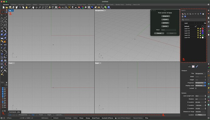
Hi, I just wanted to say, that I totally feel you, as I also moved from the v5 to v8. I managed to somehow bend the IU to be at least similar to the one I was used to. It was a massive pain, but now it’s almost usable for me. I’m still switching back to v5 with some more complex projects, though. I am attaching my current state of the UI in case it helps you with setting up yours. Feel free to ask for details, if needed.
A lot of main problems (keyboard shortcuts, cascade menus, …) have been fixed with the latest updates, but here is the list a few UI related problems, that are still bothering me a lot:
- filter/OSnap panel doesn’t work properly with narow side bar
- Tabs don’t work properly with narrow side bar
- Layer editor is ugly, icons looks childish and its wasting tons of screen space. It’s a huge regression compared to v5 layer editor (attached). Also, simple renaming of layer is a nightmare.
- This bar was always upon the Viewport! It was way better. Now I can’t find the way to change its position.
- Material editor is messy and not very useful, especially when docked
- When dragging the picture over the Rhino window (from finder to desktop or to the different app) the whole computer freezes for a couple of seconds. It happens especially when big scene is open. This is maybe the most annoying bug, but I don’t know how to capture it.
- When taking a screenshot (cmd+shift+4/5 on MacOS) some edges on Viewport became highlighted. This will make the screenshot unusable for presentation…


