Just trying to come up with a reasonably readable set of interface colors for V7, considering that the default scheme for both V6 and V7 is way too light for my taste (although I don’t want to go ‘dark mode’).
First, as has been mentioned previously, I miss the subtle gray value difference in the layer panel title bar. The V7 setup just looks bad - as if something is missing. How to fix?
Second, when I darken the UI window colors a bit - my V6 were at gray 175,175,175 - the V6 Properties box remained relatively harmonius, but in V7 unfortunately it gets more glaring with the white boxes against the gray background.
And of course the fact that the inactive tabs have the same colors as the active ones (as has been mentioned before) is not really pleasant either.
All in all, not fond of the ‘improvements’ in this area really.
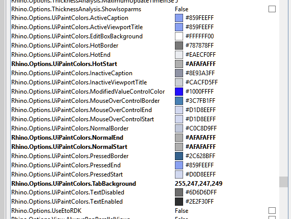
Guess I have to go through all of these and see if any of them help. It’s of course trial and error, as there is no real guide as to what the settings affect. Oh well.
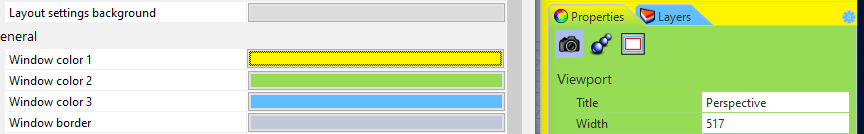
I can answer about the ‘flat’ tab colors. It’s possible to change the colors in Options/Appearance/Colors so that the tabs have different shades. Here is an example with exaggerated colors to demonstrate: