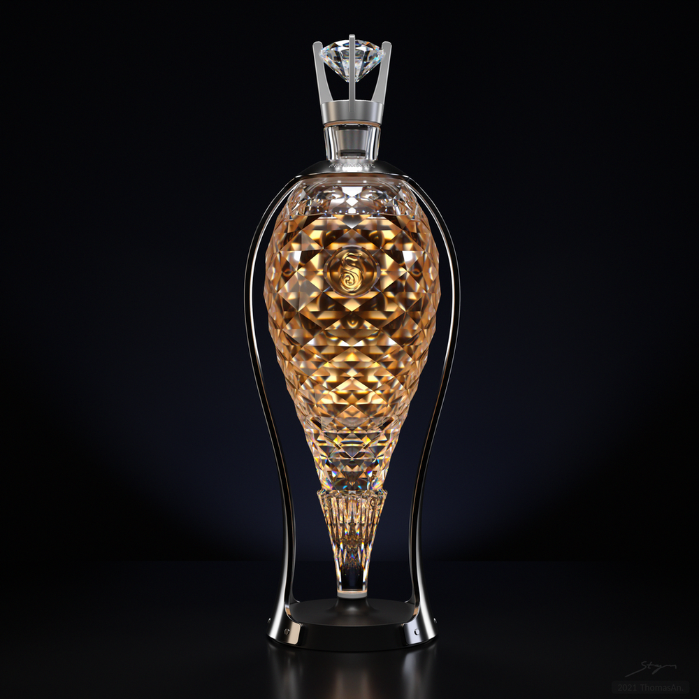
(FINAL)

30 Likes
Ooh, that’s gorgeous!
May I ask your rendering settings?
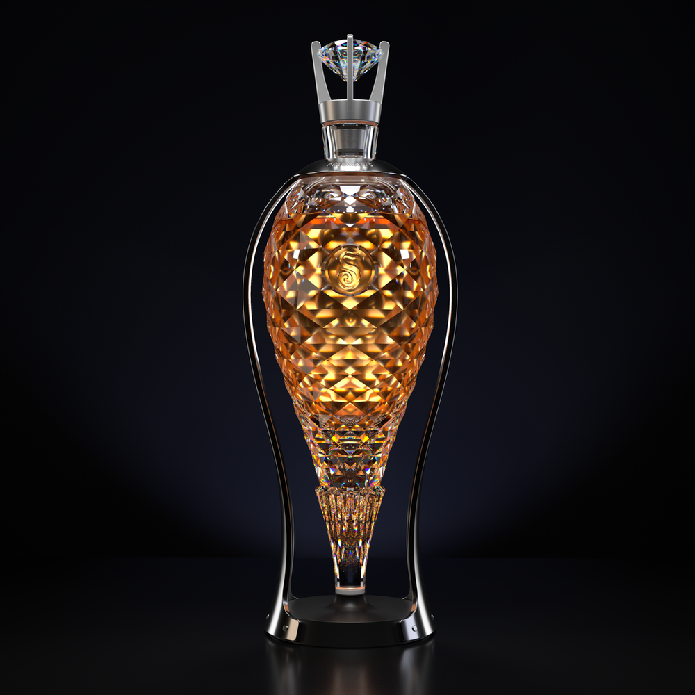
hi Thomas, i like the 2nd version a bit more, but i still think there are a few tiny things which i personally did not like so much, maybe its a matter of taste. anyway the cap seems like the material has no real definition and even if, the lighting may not help to define it well and since you place it so sublime you might have a look again maybe you can improve that. also the glass itself seems to be fine in the upper part where the liquid has not reached, but behind the liquid the glass becomes strangely hazy rather plastiky and looks rather distracting taking a lot away from the concept.
then also the perspective is a bit awkward, not saying its bad, if you want to advertise the bottle as the peak of architecture it might be a nice pun, but for a liquor bottle even though with style it does not quite seem to fit the bill… again its all a matter of taste just adding a few thoughts.
Hi Jack, this one has dispersion and scattering turned on so it won’t have the same look if done in Cycles.
1 Like
Can’t say I am quite sure what you mean. Do you have an example of something similar you did in the past ?
not that i could remember.
to help outline what i am talking about i made quick mark ups
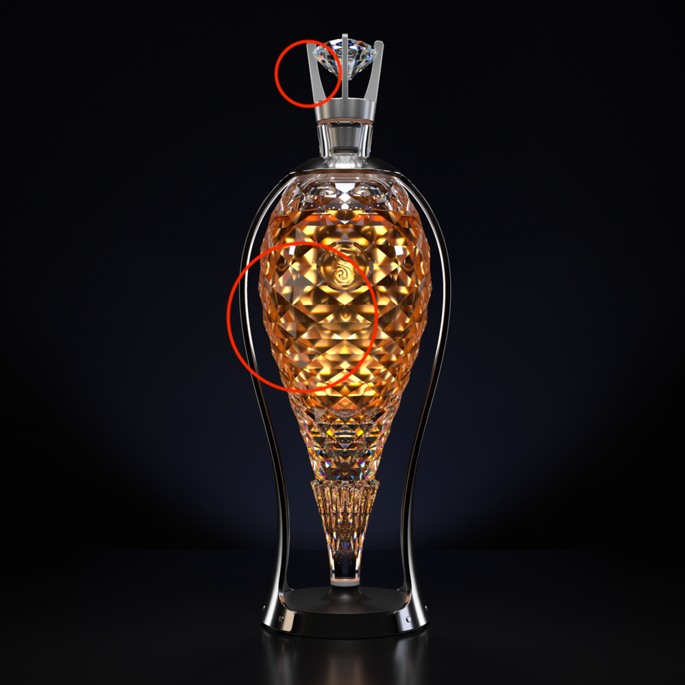
the hazy reflection in the lower part is most likely due to your lighting, i think it is not helpful in that case, since the concept looks like it is supposed to be crystalline. i would subtle it down to gain more contrast, just thoughts to play.
I know you are complaining about something in those areas, but I am not sure how your aesthetic is subjectively calibrated, or why you determined it wasn’t the intension; that’s why I asked to see if you have something similar you did in past.
i am talking about the idea, the crystaline object you have which is impacted by lighting which might not suit, creating unclear parts. for me crystals are defining clarity, while is it not that clear and takes away from that aspect.
the upper area the cap in that case has too little definition in my opinion. maybe an ever so slight bumpiness could improve the material.
Sorry, I disagree. Your suggestions will detract from the desired aesthetic.
no problem those were mere suggestions to improve the quality.
Fantabulous!
1 Like
wow- stunning!! which render engine?
2 Likes
Thanks Kyle. Currently I use either Cycles or Bella. This one was done on Bella.
2 Likes
love it- really beautiful work.
Both Bella and @jdhill are awesome, glad to see folks using it!
4 Likes
Nicely done!
I for one agree with you. The crystal glass has a strange look in the outlined part and doesn’t look polished enough somehow like the upper and lower part. The cap material to me also looks like those faux metal caps you get on bottles of Absolut. Why not make it the same material as the bottle holder?
That is the “it’s not a bug, it’s a feature” equivalent of feedback to constructive criticism.
Other than that I think it looks great.
Thanks for the criticism but it was unsolicited from both of you. If I need criticism, I always make sure the post clearly says “WIP” or “critiques”.
As an artist I have found out there are ALWAYS people unhappy even by great works. So, if I present an art in it’s final form, I don’t care if some of you don’t like it. I only make art that pleases me and the audience of my choice. I am a selfish artist.
Yes, I know it was unsolicited, but you are posting this to a public forum in a Gallery. Things that get put in a gallery will get critical review.
We are not here giving you feedback because we are “unhappy”, but we are trying to be productive and give feedback on how to improve things. That is what you do in design - constructive criticism. If you take offence at that and think nobody should question your pieces of art, then so be it. It will make you neither a better designer, nor a better artist though.
3 Likes
Sure, nothing stops you from being rude by ignoring that the author never asked your opinion for a finished work in a public forum. Also to claim you are “improving” someone’s work implies a hidden sense of superiority; it’s shear condescending arrogance justifying it to yourself as benevolence.
PS. You are actually hitting a nerve by your persistence. Let it go.