I tried the latest Rhino 8 WIP and noticed several major flaws compared to Rhino 7:
The toolbars of Rhino 8 WIP are a noticeable downgrade and way too complicated looking.
a) The majority of icons look way too dark, especially the dark blue shade, and more difficult to read than the clean icons of Rhino 7 that have a lighter blue shade which is mush easier to the eyes. The darker blue makes the icons appear too similar to each other, especially several of the SubD icons that are way darker than the others.
The icons related to Zoom and Undo view change use much darker gray for the glass lens instead of the light gray in Rhino 7.
The “Group objects” and “Ungroup” icons both could look much better should they had some better selection of colours. Here is an example of my own colourful “Group”, “Add to group” and “Remove from group” icons that I drew back in 2007, consisting distinctive yellow, blue and red circles:
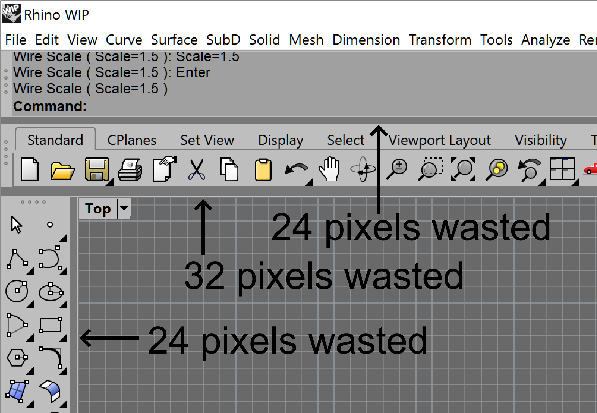
b) Even after locking the toolbars, there are 4 dots that still remain visible while doing nothing 99,99999% of the time, other than taking space and adding to the busy look of the UI. Those should be visible only after hovering with the mouse pointer over that area. Once the mouse pointer leaves the area, the 4 points must hide automatically.
c) There is a totally unnecessary dark gray border around the icons that makes Rhino 8 WIP look like an ancient program from two decades ago. Not to mention that it eats up important space. On top of that, the border is being disconnected from the active tab above (on the left side), ultimately looking like an unfinished job. Not trying to say anything bad about the effort of the GUI designers, just talking facts.
I also liked the sci-fi look of the tabs in Rhino 7 due to their chamfer on the upper left corner. That was an awesome idea that unfortunately is missing in Rhino 8 WIP.
There is an even worse, much thicker bar between any of the toolbars and the viewports, each one of which takes a lot more space while does nothing positive to improve the general look of the toolbars. This particular bar would be used extremely rarely, just to adjust the toolbar thickness (once per year?), so it must be made just 1 pixel thin to free up the space to get larger viewports. Take inspiration from a great program called Rhino 7.
Each of the aforementioned overly-thick bars flashes a lot while trying to reach any icon on any toolbar. The flashing is EXTREMELY distracting and uncomfortable to people with sensitive vision. This particular anti-user decision would stop me to upgrade to Rhino 8 when it gets released. Along with making it 1 pixel thin, it also must become active only after the mouse pointer is hovering on it for at least one second or more, in order to avoid any unnecessary flashing and to delay activation of the vertical dual arrow icon used to adjust the thickness of the toolbar.
“Add or remove toolbars” basically does not work in the way it worked flawlessly in Rhino 7. Here is a video that shows the issue:
Trying to move any floating toolbar adds a noticeable lag of about 1 seconds before the toolbar actually starts to move.
Selecting and moving surface control points also adds a noticeable lag, which is totally unacceptable and is basically painful to do. Another reason for me personally to not upgrade to Rhino 8 until this huge bug gets resolved.
Custom toolbar arrangement gets broken upon any opening of Rhino 8 WIP. My toolbars appear moved with several centimeters towards the default toolbars, forcing me to slide them again in the desired location. Rhino 7 does not suffer from that bug.
The Middle mouse button pop-up menu is way worse than the one of Rhino 7. In Rhino 7, I’m able to drag the upper bar of the pop-up menu and move if to any position on the screen while making it a floating window that conveniently stays there unless I close it manually. However, in Rhino 8 WIP there is no longer a bar on the top, so basically it’s impossible to move it around or convert it into a floating window. This is an extremely bad decision.
I have one icon on the MMB which has a linked toolbar and a corresponding tiny black triangle at the bottom right corner. However, in Rhino 8 WIP, once I open the MMB pop-up menu and accidentally hover the mouse pointer over that particular icon, it will automatically open the linked toolbar and will not hide it, leading to an unwanted distraction, inability to close it, and worse visibility to the viewports.
I’m no longer able to edit the icons of MMB the pop-up menu, because Rhino 8 WIP does not show the Copy, Link, Move and Edit tooltips while holding down the Ctrl or Shift keys.
Scrapping the ability to draw own custom icons directly in Rhino 8 WIP is a step back.
Hi Bobi - a lot of the details of the buttons etc are still being worked on - what worries me most in your comments is the window arrangement changing. That whole system has been revamped and changed over time and I wonder if it may be time to re-do your layout and see if it stays stable. Can you take a screen shot of the Options > Toolbar page?
-Pascal
Hi Pascal, I downloaded the latest Rhino 8 WIP from today and it got even worse, because the left sidebar disappeared after the update. I had to move my 3 custom toolbars on their usual place, because upon every opening of the program they are located in a wrong position. Here is a screen-shot of the Toolbars page as you requested:
On a side note, I use a 4K screen with 200% scaling from the Windows 10 settings, so I wonder if this could create some mess to the toolbar arrangement in Rhino 8 WIP? Older versions of Rhino 8 WIP didn’t had that issue, nor my Rhino 7 which works perfectly fine with the toolbars.
The rui file is a copy of the rui I use on my Rhino 7, only in a separate folder dedicated to Rhino 8, and has the latest customizations I made in Rhino 7 before importing it into Rhino 8 WIP, despite the name that suggests it’s 8 months old file.
Hi Bobi - the screen is exactly what should be properly accommodated now… I don’t think that is the problem - my guess is there have been changes that make your linked file no longer behave. @JohnM - how should we investigate this one?
And, please, remove those unnecessary dark gray borders around the icons, because they make the UI look overly-complicated and more difficult to read the icons. Why don’t keep the proven clean look of Rhino 7?
Rhino 7 in comparison. Note that its icons are slightly blurry due to the fact that they were designed years ago for low-res monitors, whereas I use a 43" 4K screen with 200% scaling, so they are basically meant for use with a 1080p resolution. I definitely prefer their thin border with perfectly balanced blue over the thick border of the Rhino 8 WIP’s icons. Since the icons in Rhino 8 are going to be based on vector graphics, why don’t let the user choose the thickness of the black border? Should be possible.
Some SubD icons use extremely dark blue shade that’s difficult to the eyes (SubD Truncated cone, SubD MultiPipe etc).
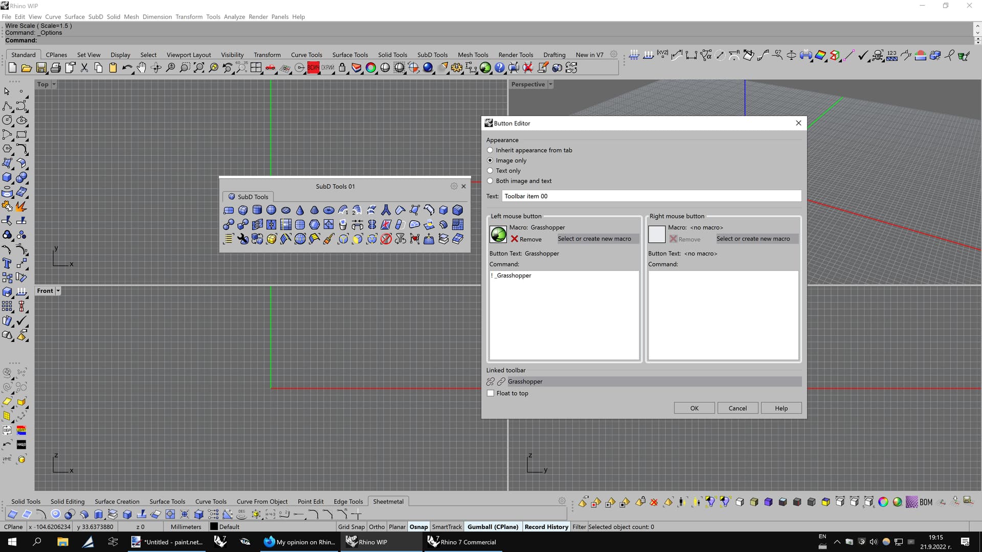
Also, not sure why some icons are named “Toolbar item ##”, since they must have a specific text. Here is how the GH icon appears as “Toolbar item 00”:
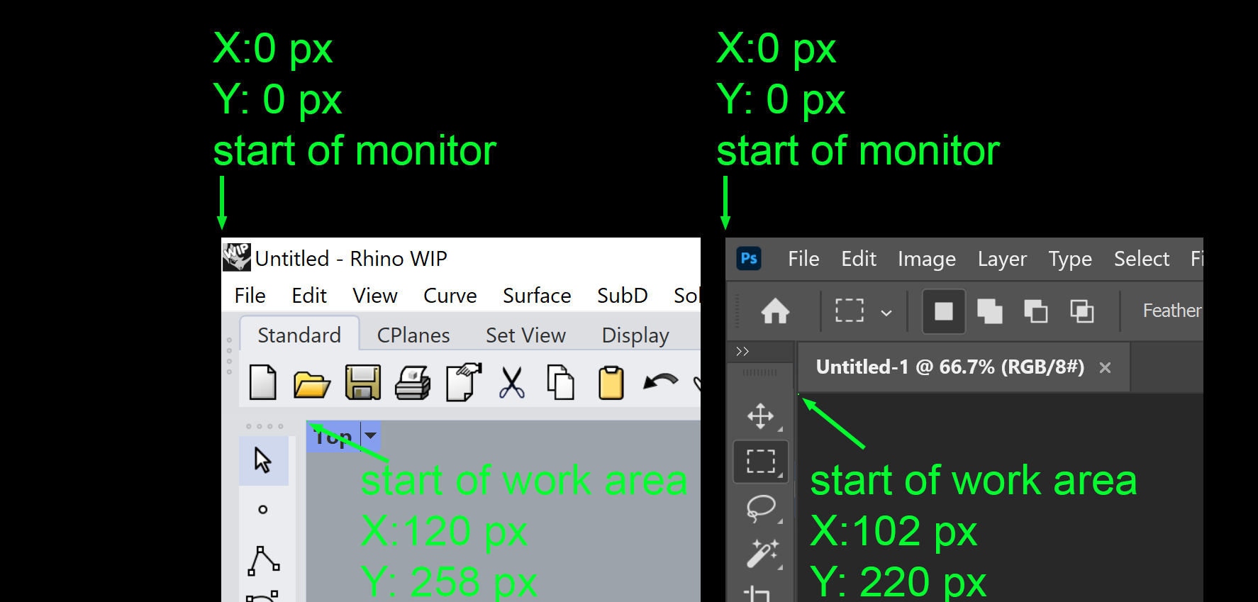
hi @Pascal, besides all the very good feedback from Bobi, I wanted to point out something else. I know this is all preliminary, but up t oV7 the amount of frames, outlines and padding around icons was already problematic, and my hope is that with a re-write things would get better, but so far they are worse, using a lot of extra pixels.
Here please see from the upper corner of the screen, how many pixels it takes until you see actual workarea (viewports or canvas), compared to Photoshop (it’s similar with a lot of other creation software):
I will add another clear disadvantage of Rhino 8 WIP’s UI. I consider it a bug, because it behaves in a highly unwanted fashion. It’s an addition to point number 4 from my original post:
4b. Right-clicking on a blank space of a toolbar to “Add or remove toolbars” will add HIDDEN tabs to the vertical docked toolbars, ultimately forcing the user to unlock the original docked tab, move it towards the viewport and eventually be able to see the hidden new tab consisting another toolbar. Then, the user is forced to detach the tab to separate the newly shown toolbar, and then move the original toolbar to its old place and adjust its shape, because 99% of the time it gets lost.
In Rhino 7, this whole struggle is non-existent, because a right-click on a blank space of any toolbar lets the user hover over the “Show toolbar” pop-up window and then show (or hide) any toolbar from the vertical list. Once that’s done, the newly shown toolbar (or multiple toolbars) appears as a floating window inside the viewport, giving the user a convenient way to choose from 4 options:
Keep the floating window and use it that way, or move it around the viewport, with the ability to quickly close it when it’s no longer needed;
Drag the floating window and add it as a tab to an existing floating toolbar;
Drag the floating window and add it as a tab to an existing docked toolbar;
Drag the floating window and make it a docked toolbar next to an existing docked toolbar.
I suggest to learn from the great UI of Rhino 7 and keep the things simple, user-friendly and with toolbars taking as fewer pixels as possible.
Bug number 12: Just opened Rhino 8 WIP again, first time since I reported all the bugs and downgrades yesterday in this topic, and there are a whole lot of problems that appear for no reason.
First off, nearly all icons lost their RMB command. Then, every toolbar except for the left one lost their tiny triangle at the bottom right corner that opens the linked toolbars. All the custom macros I had in numerous icons also got lost. That’s on top of the bug with the toolbar arrangement which loses its state upon every start of the program.
Also, the issue with the bad rendering of the edges of polysurfaces reported in this topis is till not resolved in the latest Rhino 8 WIP, despite the claim that this particular bug has been finally fixed. Rhino 7 renders those much better.
Check the last one named RH-66088. Still not fixed:
Shot in the dark with out reading alot about WIP trouble:
Have you tried running Rhino 8 once with "Run as Administrator " ? I recall this solved a similar issue back when V6 was in beta if memory serves me well.
No matter how I run it, it still loses the state of the toolbars from the previous session.
Bug number 13: Each time I open Rhino 8 WIP, it disables: Grid snap, Ortho, Planar and Record history. On the other hand, Osnap and Gumball (CPlane) are active. This happens even after I removed my linked RUI file and run as administrator a completely default Rhino 8 WIP with no custom changes.
I’m aware of the tabs and all that. And because I want to continue to use tabs, and I also want to continue to use the command line, we don’t want the new workspace tools to get all padded everywhere and lazy.
In order to have enough room for our work, we need your team to budget their pixels very well in all areas, this is why I posted a side-by-side example with tabs of what V8wip has now vs. what I think it should have:
Exactly my thoughts, too. Way too much space was wasted for unknown reasons that do zero favor to the users. This is why I posted my 2nd and 3rd images in the original post where I compared Rhino 7 and Rhino 8 WIP.
Not only the main toolbar at the top has an unnecessary dark gray border, it’s also surrounded by two extra thick bars (one above and one below) that the Rhino users don’t need at all. Along with eating up important space and reducing the size of the viewports, they are also flashing in a very distracting way upon each hovering with the mouse while trying to reach some icon or the Command line. In order to click on some option in the Command line, a simple mouse movement will cause those two thick bars to flash 4 times total!
Leaving those 4 dots next to each toolbar is also a huge mistake, because they reduce the space and make the UI look busy. Why the Rhino users will be forced to see those dots all the time while they work? I suggest to make them invisible unless the mouse pointer hovers on them.
I completely agree. I didn’t even mention the dots because then I would have to get into proper UX standards, guidelines, mouseovers, grids, etc. And I’m not their UX designer. so I’m limiting my feedback to one simple and hard-to-argue concept: “Pixels are not free, please don’t use them irresponsibly”
Please, yes, I have been wishing for so many years to be able to dock the cmdline on the side. It is so insane to me that it became possible to put it in a toolbar, but yet not to dock it on the side:
Who ever is making decisions about the layout and appearance of the user interface is acting as the designer. Whether they are referred to as the “designer” and whether they have appropriate experience and knowledge is a different question.