Hi there,
In recent studios for landscape architecture, we’ve been learning ArcGIS Pro. While it can be a challenging programme, it does have some features which are beneficial, and may benefit Rhino users.
In general, when creating images with hatches; such as maps or diagrams, it can be difficult to overlay multiple hatches without it becoming messy (rhino).
Example 1. In the image below there are 3 hatches. Their individual colour represents three indicators. But when they overlap with their transparency, these colours blend. With 3 overlaps, it might be okay, but when there are more overlaps, it can become difficult to understand very quickly


Add to this, that many people are colour blind, and this makes subtle differences in hue and shade indiscernible. I believe that this is why some public governments use black and white for public proposal diagrams to help visual accessibility. However, in the image below, you can see that it’s very difficult to discern one grey value from another.

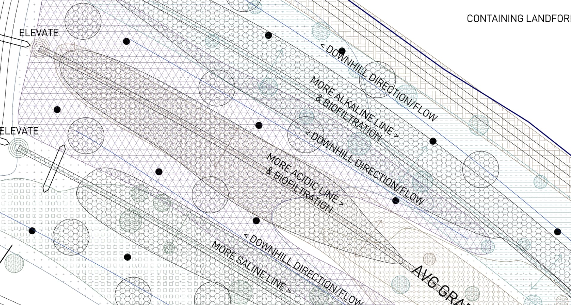
So then come the role of pattern hatches in greyscale. With the stock hatches provided in rhino, each pattern has been set to scale 1. However, these individual patterns do not line up, and where they overlap is visually disruptive and confusing.

So how can legibility be pursued with lots of layers, and that accommodates colour blind people?
The way rhino interprets hatches or fills is different to Arcgis. In Arcgis, it asks for what the element is, what size, what spacing, and what offset etc.

With multiple layers of this type of hatch set to the same spacing, and similar sizing, but with different shapes and offsets in Points, overlapping layers can achieve legibility.


Can such a hatching feature set be similarly implemented in Rhino?
-Jeremy