I have a few questions about how we can make rhino better for making patent drawings, if you have experience doing this type of work, please respond to this thread, or email me kyle@mcneel.com
Any half decent drafting service can make patent drawings fairly effectively in a variety of software. Is there a particular aspect you are looking to develop?
mainly the formatting, annotation style, etc… Basicaly I’d like to take this: http://wiki.mcneel.com/_media/rhino/patent_drawing.zip
and make it more full featured so less user formatting is required.
but, I have not done any of this type of work, so I’m interested in hearing form folks who do as to what is missing and what would make this more useful.
1 Like

My recent experience doing patent drawings(albeit for small-time American clients) is that the whole specific “patent drawing style” is obsolete. Whatever gets the point across is fine.
2 Likes
That’s been my experience too.
1 Like
can you post it?
1 Like
I did a lot of patent drawing work between 2000-10 Rayflectar Illustration
Used Rhino always as a starting point, but never as total solution. The main issue was shading, Utility patents use light shading using parallel lines (more so for design patents) and design patents occasionally require stippling. All this work needed to be done in Illustrator back then; heavy use of their live blend-curve tool since it also allowed to vary the thickness of the curves closer to an edge.
There is a drafting “suggestion” by the PTO originally published in the 90s which essentially created a patent “look” and feel, but they were never really militant about it. Occasionally (rarely) you get a drawing rejection, but I have seriously seen patents published with an attorney’s hand sketches.
Patent drawings are usually done nicely if the inventor has some pride in the printed patent itself. Otherwise stick figures do just fine. Large companies like GM, or Apple that don’t care about patent aesthetics publish some very crude drawings (often deliberately minimal and crude).
3 Likes
The patent office believes that everyone makes drawings with black ink and paper, and that it is impossible to reproduce any color except black color. This is the reason why all colors except black are prohibited.
1 Like
I thought it was to make sure that faxing a fax or copying a copy would always result in the closest possible version of the original.
1 Like
I’ll rework it a bit and post a version if of interest.
Should I redo it to output an image than can be saved insted? Or is a pointcloud a good idea?
I figured a pointcloud would be good since points can be deleted and it’s easy to combine with a line drawing.
1 Like
not sure- my 1st thought was for an image, but having it be something that could be edited is compelling- anyone else have an opinion?
1 Like
Hi Kyle, all,
I don’t know how patent drawings are done in other countries but in the US you don’t need the stippling, in fact, you don’t even need a specific shading type of drawing, however, there are situations where the linetype does matter, and that’s only in design patents.
Here’s an example of one of my old (expired now!) design patents, all the solid lines means that those are defining edges that the patent is trying to identify as protectable invention:

you will also see parallel shading lines that are not touching the solid edges lines. Those don’t have to be parallel and can be in any direction, the can even be shading (like a shaded viewport) AFAIK
full patent will all illustrations here:
soundDock_USD514090.pdf (336.3 KB)
Now look at this other design patent example, where non-patentable elements are purposedly left as dotted lines, so the focus of the design patent is ONLY on the solid line stuff:

full patent will all illustrations here:
bose700_USD840973.pdf (260.6 KB)
We could argue about how useful design patents are, but more importantly you all should know that they really aren’t useful unless you have an army of lawyer to defend them, so in this case I’d better leave it to those lawyers to tell you specifically want they want you to draw, and how.
I’ve done design patents artwork, but it was always different, and always based on what the experts wanted me to capture, and not capture. So I’m not sure there’s a good automation workflow in place here, other than being able to using solid vs. dotted lines to various edges of a model.
Now, let’s talk about utility patents: These are the more important ones, and for these any drawing still works, even photographs are now accepted as illustrations.
Here’s a utility patent that I did by myself, it was all done in Rhino with Technical view and the shading lines were curves in the model.

full patents here:
tablet_stand_rhino_generated_US9335791.pdf (3.2 MB)
in this case the shading still is not important, it’s all about capturing the idea in the most unequivocal way possible (unless your strategy is to be ambiguous, but that’s a separate topic).
Here’s another utility one, where I gave the lawyers a few technical view captures and their illustrators added some extra shading lines:

full patents here:
thumbcam_US10075624.pdf (1.7 MB)
You can also get a different style perspective from sites like patently Apple, you will see they are even using shitty drawings and/or colors these days:
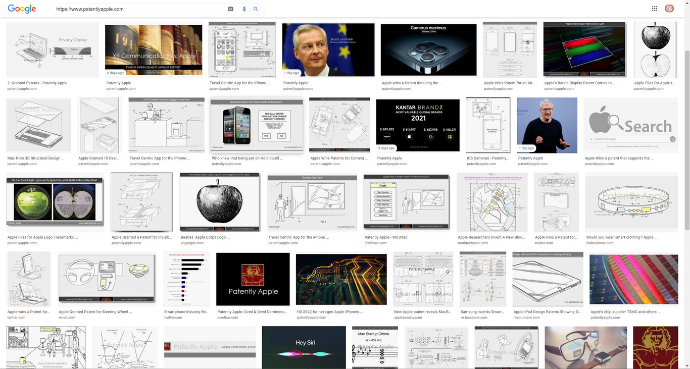
If you chase some of those Apple patents you will see that the nicest drawings are the design patents and you will also notice the difference between solid line (= we want to patent that!), dotted line (= that’s in the product, but if it was different that’s fine, it’s not defining the design elements we are patenting), and shading lines (usually not touching the other lines). The whole stippling thing… it’s more of a Wall Street Journal look, at least on this side of the pond.
I hope this helps,
Gustavo
10 Likes
That’s super valuable information, thanks for thaking the time to write it all down and finding all the images.
None the less, if some are interested in a dotted shaded image to go with a 2D drawing I just updated the script with a lightness multiplier and a viewport frame to match the 2D drawing.


This could quite easily be combined into an automatic tool that also removes all points that are close to any lines from the make2D. But I don’t need that tool, so I don’t think I’ll add it just for the fun of it. So shout out if it would be useful.
PS! I could also combine it as an image, harvest the technical display, add the points to that image and present it in a viewer to save it.
2 Likes
I’d be interested in that script. Did you post it somewhere? Thanks and Happy New Year!
1 Like
Saw this thread and wanted to leave a long-ish note on annotations. I think one thing that would improve any kind of annotated drawings (including patent drawings) would be a better Text tool and additional text commands. This is one area where Rhino still feels a little clunky to me compared to some other programs (particularly Adobe.) I’ve compiled a few notes around annotated drawings where I think Rhino could be a lot more efficient:
-
I think a series of text editing commands would be useful in addition to adding stuff via the Text command popup - like typing Bold for instance, to embolden your text
-
The font searchbar in the Text popup could be more efficient if you could type multiple letters. Right now you have to type the first letter of a font and then scroll around to find it.
-
Units should be adjustable (i.e. points are common for American typography. Right now I type like 12/72 inches to get my 12 point font, which may be required by an office.)
4. It would be nice to be able to select and edit text directly in the Viewport rather than having to go back into the Text popup.
-
There could be more snaps on the Text object bounding box. For starters, there could be the ones would be for a normal rectangle shape. ALSO, there could even be additional toggle-able snaps on text objects, such as a baseline, X-height, ascender, descender, and cap height. Right now you often just the Cap and the Descender (highest and lowest points) which are not the most useful points to be working with when moving text around and aligning it to stuff (see here for definitions of these terms)
-
Additional settings for fonts: Small Caps, ability to adjust kerning, letting, tracking, vertical scale, baseline shift, slant, indent, drop caps, support for bulleted/numbered lists, justified text, easy access to the full glyphset of a font would all be useful.
-
Ability to “Flow” text from one textframe to another (for say, a two column page where you’re revising the body text) - Also as an aside, it would be fun to be able to put text into a custom shape like a weird closed curve.
-
Ability to select multiple Text objects and change a property all at once. Say I have my document and I have it all in Copy but the place i’m working for does everything in Helvetica - changing everything individually here would be a pain and I would want to change it all at the same time.
Sorry this is a lot. Happy to put it elsewhere if this isn’t the right thread for it. But overall, I think Rhino would be a better design program if it better supported design that uses typography.
4 Likes
I did extensive work on this in 2013. I have a background in the concepts prior to that. And have also had it on my mind ever since.
The reason I ever got into this type of work was due to the awful drawings that I’ve seen people paying for through their patent attorneys. They would pay hundreds of dollars for one or two or three pieces of garbage drawings, so I basically took over and took it to where it needed to go.
My proprietary process at the time was a combination of Rhino and Photo shop techniques.
That link isn’t working on my end.
It’s been a while since I reviewed the rules. Basically the patent office, doesn’t make it very clear. Last time I checked, their rules were very simple and basic.
It all has to do with one thing, which is based on ancient technology of copying machines.
You see, a good patent drawing is based on the basic ability for it to be ran through a copying machine over and over and over until the image is deteriorated to the point where it’s no longer legible.
Hence, a good drawing will be durable in the sense that it wont degrade quickly as it undergoes such a process.
But this is based on ancient tech, as I mentioned. And the patent office also allows photographs to be used in the place of drawings.
While photographs aren’t always the best approach.
It’s really the volition of the person paying the bills that decides what the illustrations should be.
Cheap patents aren’t always the strongest, and expensive drawings are often bad drawings.
Maybe true, but if Rhino had a cut and paste workflow for users, then it could help the world be a better place, faster.
Yes attorneys enjoy pretending like they can interpret designs and illustrate them, leading to the worst drawings in the world. Hence, expensive drawings.
Indeed.
I found stippling to be the best approach, especially algorithmically.
I disagree.
Show me the rules or parameters that describe this ideology.
Again, where do these rules come from?
Maybe true, but hidden lines also typically have a similar composition if they’re to be illustrated. Where’s the rules I’d say?
Yeah I’ve seen the worst drawings come out of scenarios like that.
I created a workflow back with Rhino 5 and CS6 in 2013. I know it’s possible.
Yeah, see even the patent office thinks photos are okay, now.
Well, that’s where stippling can be done algorithmically so that it adds to the unequivocalness, and the ancient copy after copy after copy machine problem – or rather deterioration of resolution problem.
“shading lines”. ![]()
I agree 100%. I’d recommend having more options for the stippling characteristics.
This was the secret sauce to my stipple parameter within my workflow back in 2013:
Pixeology Homepage ![]()
Although, their support was terrible, and in 2019 I basically couldn’t get them to help so I gave up on it.
@lander
please notice, this topic is from April 2021.
@theoutside
maybe Kyle can comment if it is still relevant ?
1 Like
I don’t see how it wouldn’t be.
it got very little internal traction… Needs a push from users if it’s going to get any more attention.
1 Like