This is a plugin presentation. Updated to v1.3.0 | 16/05/21
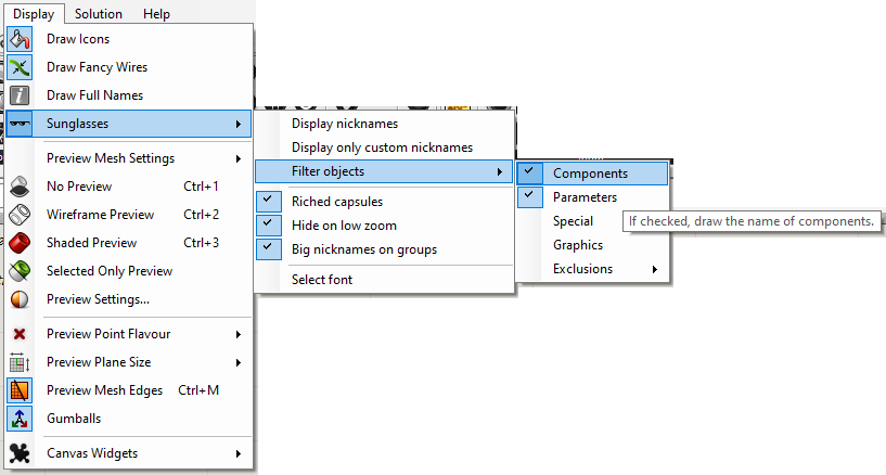
Draw the name (or nickname) of Grasshopper objects with Draw Icons mode on. It also enriches the capsules when you zoom in to understand the component and visualise its data at a quick glance.
The advantage with the alternatives (and the reason for it) is that this is a purely graphic plugin, you don’t need any component to use it, it is modified via toolbar, and it doesn’t create any object inside the canvas either, it only affects the canvas visually. Besides, you look much more stunning with them.
Download the last version of Sunglasses.gha from Food4Rhino.
Make sure Sunglasses.gha is unlocked, right click > Properties > Unlock (if visible).
Copy and paste it in the Grasshopper Libraries folder, usually: C:\Users\ < YourUser> \AppData\Roaming\Grasshopper\Libraries.
Restart Rhinoceros and Grasshopper.
Usage
This plugin does not contain any components. Access the user settings from Grasshopper Toolbar > Display > Sunglasses to enable or disable, draw the nickname instead of name, change the size of the font and include or exclude objects to display the name.
These user settings are stored in grasshopper_kernel.xml file in the Grasshopper folder, with the prefix “Sunglasses”. But I don’t know why you should use this.
Chatted to Dani via PM and Sunglasses is now available again in the package manager for Rhino 7. Sorry for derailing the discussion away from the plug-in itself!
Extremely impressive piece of work! The first thing I notice is the .gha file is ten times larger than it was before: 187 Kb instead of 18 Kb.
The optional “Riched capsules” feature is amazing but requires extreme zoom (973%) for me to see it. Probably overkill and I may not use that but it’s definitely COOL.
I think I know the answer but just to confirm… Unlike Bifocals, this only works for those who have it installed, right? And there is no performance penalty for using it?
P.S. Why is this thread no longer in the Grasshopper category?
Can you tell me which component is lagging? If any description is too long, the method I currently use to adjust the font size to fit the text in the space is very slow and I need to fix that.
The smooth transition between riched component & non-riched component, aka gradient of text sizes, may be the slow part.
btw, i usually target the lowest Rhino version possible to serve maximized end users. Don’t know if there’s a must targetting RHino 6.32. You may reference older versions from nuget packages
Well, it’s hard to say that exactly what component. I haven’t tested many things yet.
Maybe it’ depends hardware spec… I’m testing it on my old labtop now.
Each file is a little different, in some cases a bit severe and in other files,there is no lagging at all.
1
With “Full names” on, there is space.
But usually we have that off, and inputs and outputs are 1 character (rarely 2 or more).
The space of 1 character is not enough to have the texts and descriptions on 1 row.
I would consider useless the icon and component description at this level of zoom:
Removing them (or making them smaller?) would leave more space for input/output descriptions.
2
Parameter name have “(as List)” or “(as Tree)” on the same line, font and size.
Then there is the description with smaller font size and on a different line.
On your “Riched capsules” it seems that the “(as List)” or “(as Tree)” always falls on the description line.
There is few space so maybe it was a choice of yours (to avoid having even the title use 2 rows…?)
3 (not a real problem)
Riched capsules are drawn in front of everything… (?) if there are overlapping components the riched capsules will badly overlap. But components shouldn’t overlap to begin with…
4
if you still are working on this, i propose for an addition, which might be really questionable.
To avoid that^ … maybe it is possible to increase the top “hitbox” of a component? so group will “stay away”…
Or add a background rectangle. (maybe this will make everything become much uglier)
This is a problem only when attaching a screenshot of a definition and the hovering text feels a bit strikethrough
Nice work! Time will tell whether I use that and/or move panels around, I suspect a combination of both.
Works very smoothly for the one file so far that I’ve looked at with it.
EDIT: Still in my GH rookie year, so I always “draw full names”, so plenty of room for data in my components, almost too much! Very nice feature, I’ll definitely leave it installed, unless it slows down a huge definition too much. Even then, it’s always important to be able to use clever workflows to mitigate choking definitions anyway, so I’m sure I’ll manage just fine with it installed. Thanks for the great work!
I noticed some severe lagging at one point as well, where I was zoomed in enough to inspect input data and had a data tree with many branches and items. The canvas appeared to freeze up and it took awhile to zoom out which “fixes” the problem.
I noticed an inconvenience when I went to disable filtering. Being able to uncheck only one box at a time since it causes the dialog to disappear, so requires multiple clicks to reopen that dialog, uncheck one more and then repeat.
No, it was definitely very slow when the parameter had a lot of data. I have solved it now.
The way it works (I did it years ago but now I’m polishing it) is drawing over the normal capsule in the rectangle that corresponds to each parameter or center of the capsule, these regions I can’t control because if I did it would break some other attributes. There is another option that would allow me to have more control and it would be to parasite the attributes and to include a lot of calls using System.Reflection but as aesthetics of the code it is very ugly.
And that’s why that happens. There is too much variety in the attributes and too little consistency of drawing processes for me to be able to parasitize the attributes so that I can redraw them exactly the same.
Yes, I had to put it in the description because the name has too little space.
It is good. Now the description of the parameters is zoomed in to give more space to the data.
I think I have solved it but I don’t know what side effects it may have, so let’s see.
By design, it only calculates visible objects and you can’t have too many with so much zoom.
Yes. It is fixed now.
Yes, but the cost/benefit for me to improve that is very negative.
Please test this version. It also works for floating parameters with icon mode. Sunglasses.gha (190.5 KB)