If some UI elements scale correctly, and other UI elements do not, then it suggests that it is an issue with certain UI elements. Do you agree with this?
Can Rhino use different UI elements, or as Helvetosaur suggests change the properties of the existing UI elements?
Yes, most likely the issue is in the coding of those programs, not Windows itself. Some programs use UI elements such like framing and border with a set thickness in pixels. So, if the pixel width of window border is set to 2 pixels, it will render as 4 pixels wide at 200% scale from Windows. If the scale is 150%, then the same border should be rendered as 3 pixels wide and be sharp looking. However, a scale of 225% will cause some blur of the image, because the 2 pixels wide border must be rendered across 4,5 physical pixels of the screen. Some programs don’t do that and instead windows renders their border at a slightly different scale to preserve their sharpness (like 4 or 5 pixels wide, instead of the impossible to render 4,5 pixels wide that causes blurriness). The same happens with tick-boxes if they are programmed to render as full pixel thickness only and can’t be converted to “exotic” scale factors that would make them blurry.
Yep, but as I stated before I do not believe that is the problem here. The SelectionFilter and the ObjectSnap panels are designed to “snap” to a predetermined grid to accommodate the item description texts so their dialogs are not continuously variable in height and width. The grid id determined by the possible length of the descriptions, which can vary according to the language Rhino is running in. Hence the grid is designed to to accommodate the longest texts possible, for shorter ones, there is always leftover space.
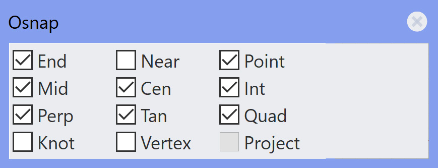
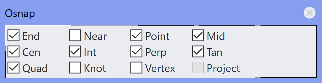
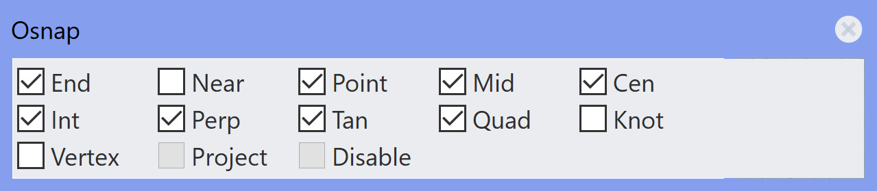
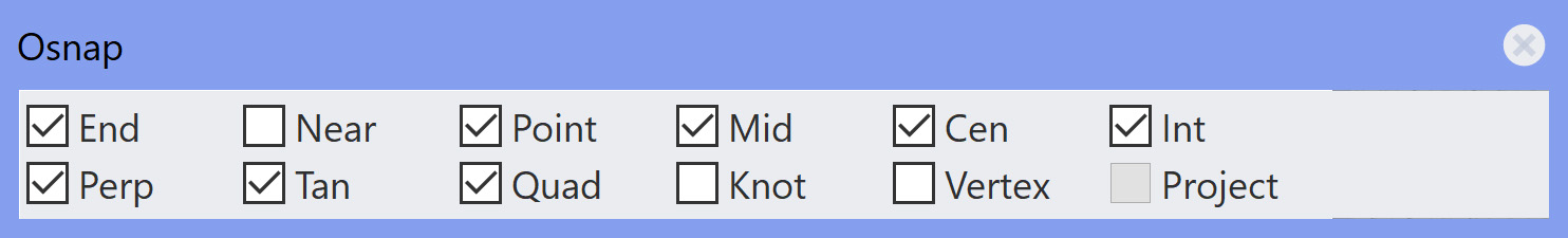
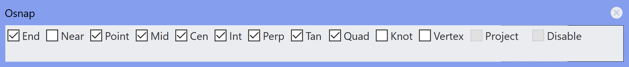
When there is some extreme display scaling, these predetermined grid spacings appear to break down, seems like Rhino doesn’t think a certain text can fit in a space, so it goes blank. The Selection Filter is a worse case than the OSnap panel, but both exhibit similar symptoms. Here at 300% scaling is the OSnap toolbar with the different horizontal grid settings starting at the smallest horizontal possible.
1 grid: Note everything is blank

2 grids: Note only gets to “Perp”

3 grids: Note only gets to “Knot”
4 grids: only gets to “Project”
5 grids: same but less height and more width
6 grids: finally get to “Disable”
7 grids: “Disable” is gone again
8 grids: “Disable” is back
10 grids: some extra space on bottom
12 grids: lots of space on right
Note some of the images may be scaled by Discourse, but the originals are all 100%