UI Scaling & Button Size Proportions in the Age of 4K–8K
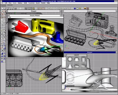
Looking back at the early Rhino interface (see screenshots below), one thing becomes obvious: the ratio between button size and workspace area was different.
IMO adaptive is the most important aspect that @AlanMattano pointed out. Usage is spread across many different screens sizes, resolutions, aspect ratios and increasingly different devices as well. Acknowledging this and designing with this in mind started with adaptive web design and most applications today have incorporated this into their UI since quite a while now. It’s really nothing new at this point. But for some reason this gets totally ignored by the Rhino team. I had mentioned the lack of adaptiveness in the Rhino UI in other posts before but there doesn’t seem to be any interest in this. To me the fact that the Rhino UI is outdated isn’t so bad. What’s really bad is the fact that the Rhino devs don’t seem to even acknowledge it and therefor there is no hope for the user to at least have a positive outlook that soon a modern UI will make work with Rhino more pleasant. It’s just not happening. Comments like:
…demonstrate this point very well. The devs aren’t even able to realize the situation. This will usually be responded with - can you give a specific example?
It’s frustrating.
Sorry that I have to voice my frustration regarding the UI here, I really want Rhino to get better but at the moment it looks like Rhino 9 will have again the exact same UI. Maybe and hopefully I’m wrong about this - I haven’t yet tried the WIP.
Oh, I miss those mine-sweeper buttons… glorious days!
I even bought a Matrox Millenium to power Rhino (I think it costed $500 back in 96), since it had a dedicated 3D chip, but Rhino didn’t support it… But it was good for games, so money well spent none the less.
weird, i thought rhino followed whatever display scaling was set in windows. personally, i loathe buttons/toolbars/windows/tabs, so smaller icons/buttons are always welcome. it is strange that the windows scaling doesn’t affect the size of icons in rhino though.
edit: ah i was modifying display settings of monitor that was facing away from me which is why rhino did not scale on the monitor i was looking at
This setting works, but it is hard to find because it lives in an unexpected sub-menu.
When you open Options, Size and Style is not visible by default, and most users expect UI scaling controls inside Appearance, not buried inside Toolbars.
Adding a clear shortcut or note inside Toolbars that directs users to it,
would make it much easier to discover.
About the UI discussion
Yes, Rhino’s interface being “old” is not necessarily negative. Has improved over time.
All professional tools go through this. Blender once had a famously difficult UI before its redesign. ZBrush changed dramatically, but not always in ways that help new users. Rhino instead evolves slowly, maintaining the Alias-style logic that makes it consistent and familiar across versions. New ideas from Unity, SketchUp, and Plasticity will eventually influence it, but each feature needs its own focused thread and discussion. You need to isolate an idea and make a thread.
Yes, it often feels that way — though we can’t really know. We can only guess from the outside.
Only someone like Fangio could both drive at the limit and build the car. In most cases, users push the tool far harder than the developers ever can, simply because developers spend their time programming, not modeling all day.
And it’s also true that when you look at certain long-standing bugs, you can tell there isn’t much TDD behind the scenes.
Switching between displays
One practical question remains:
When working on an HD laptop and plugging into a 4K or future 8K display, do we need to re-adjust Rhino’s UI scale manually each time?
Some users prefer Windows Display Scale at 100%, others switch between a 4K TV and an older large monitor. In those scenarios, Rhino could benefit from a more automatic or centralized UI scaling control.
On Rhino 9’s direction
Yes, the UI is changing slowly — perhaps more slowly than many expected — but there is steady progress.
For reference, Unity’s modern UI is the best example (for the past two decades now). Rhino is moving in that direction, just at its own cadence. I’m amazed by the speed of Plasticity s growth.
Yes, that’s true, but at 8K resolution, you often need to increase your mouse speed, and that inevitably reduces precision when clicking small targets. To work efficiently at that resolution, the icons need to be slightly larger. And, realistically, as we get older, physical limitations make small interface elements even harder to use.
I typically set the display scaling to whatever matches best with the size I am after. My icons are always 24 logical pixels. On my laptop this means 150% scaling, on a 4K screen I’m using 200% scaling.
Some buttons are hidden because I didn’t close any toolbars before scaling the interface. You’ll lose the default layout, and your muscle memory will still target the original button positions.
The hidden tools behind the [>>] button can also cause confusion for Rhino beginners and may trigger additional UI issues.
You technically don’t need to close small floating toolbars, but if they are already open, they won’t refresh their size, which will hide some buttons.
Suggestion
When scaling, please also update the perimeter size of floating toolbars. [AM56]
there is a pattern that it produces the same type of responses sometimes the responses get “strange” if one read them out loud it’s easier to identify it
Just an observation i thought it was interesting this is why I asked