Hi Leland -
Controls for appearance are not totally consistent. Some of the things you’re asking for are possible but others currently are not - this is due to a number of factors, not least of which is my own relative ignorance of WPF at the time I started Human UI - but also that controls (like the toggle, for instance) come from 3rd party libraries and don’t behave the same as other controls.
I’m gonna try to answer your questions one by one with the “official” answer and then at the end show you a hack that may help you get around some of these limitations.
- Toggle Title font, font color, or font size
Generally, the most control you have over fonts is setting a global font for the window with the Create Window component; this will affect many but not all controls. The toggle, radio buttons and others are unaffected by the base window font. As for font color and size, where this is possible, you should be able to adjust the font color/size with the “adjust element appearance” component - set the foreground color to adjust the color and size to set the font size.
- Expander panel background color
The expander panel Is actually transparent - the background color will show through whatever container its in. In your case it is the Tab control that has a white background color; you can set this by adjusting the tab control’s background color with “Adjust Element Appearance” again. The expander itself does not have a background (due to some settings applied by the Mahapps.Metro style library I’m using).
- Tab Heading font size
Sounds like @Will_Wang solved this one for you 
- Can I make body fonts different styles from header fonts?
Generally speaking, no. However, that brings me to the…
SUPER SECRET HACK
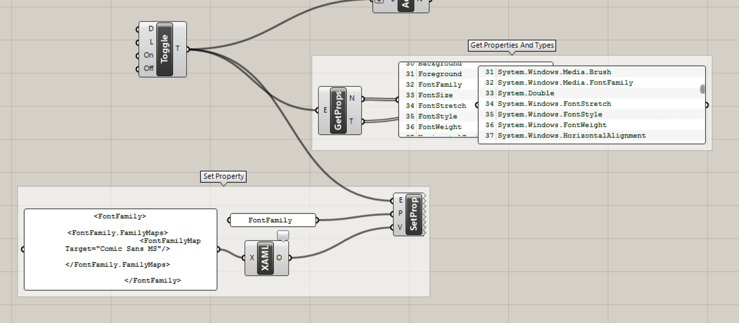
Ok, it’s not really a hack. It’s just a tricky experimental feature that is largely undocumented, and requires some knowledge of WPF to use. There are two special components in UI Main called “Get Element Properties” and “Set Element Property”:
The first one lets you see ALL of the defined properties on an object (and their types), and the second one lets you attempt to modify that property on an element. Some properties take simple types (String, Boolean, etc) that you can set directly; others take more complex types (e.g. System.Windows.Media.FontFamily) and you will have to figure out how to construct that object with XAML. Another component - “Create Objects from XAML” - can turn XAML syntax into proper objects.
Here’s an example of setting the font on a toggle element:
You have to know a little bit to construct the correct XAML - some types are easier to build up than others.
Some Human UI elements are actually composed of multiple WPF elements - so things can get a little trickier. The “Text Box” for instance is actually a dock panel containing a label, a text field, and a button. So to alter the label font you have to get creative, and build up the control + label separately:
See those examples set up in this file: get_set_prop_Example.gh (15.1 KB)
With those tricks, you should be able to get the appearance to whatever you want… it may just be a question of diminishing returns on effort.