system.txt (5.8 KB)
Hi,
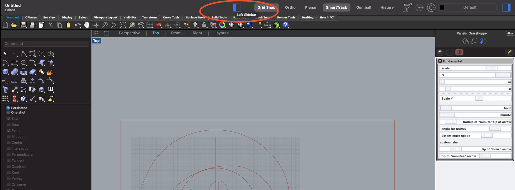
I find a bit disturbing the “Hide Left Panel” button lying on the middle of screen. I was looking for it on the left of the screen. Is this a shared disturbance ?
system.txt (5.8 KB)
Hi,
I find a bit disturbing the “Hide Left Panel” button lying on the middle of screen. I was looking for it on the left of the screen. Is this a shared disturbance ?
I’ll second that. Also a surprise to find the file name flushed left vs. center of the window.
Is there a UI problem that you are intentionally fixing, or was this just a random change.
I’m seeing it in the MacOS version v7 latest update - does this mean the MacOS and Windows versions are totally in sync now?
Thanks for the post, I filed https://mcneel.myjetbrains.com/youtrack/issue/RH-62335 for this to get cleaned up.
on the plus side, I do like the new look with the title in bold on the left and secondly, the toolbar has become thinner = more screen real estate 
But I agree, having the Hide Left Panel in the middle does noe make sense…