I have a branch of points in an Excel file which has their own x-y-z coordinate. I want to visualize these points in Rhino (as shown in the picture). My idea is to use the gradient component to compare the z-value and then map it but I am not able to do it. Does anyone have any idea?
What do you mean? You want your points to be shiny? If so you could always generate spheres rather than points and then render them with a custom shiny material?
I have another question. I am using the “FabTools” plugin to bake the color point but it is too slow due to too many points. Do you know if there is any more efficient method to bake the color out?
There are quite a few tools to bake geometry. Lunchbox has one, Human has one, Elefront as you noted is dedicated to this somewhat. You’d be best off installing them all and seeing which you prefer. I use the Lunchbox tool most often for baking geometry but I’m rarely concerned with rendered images so don’t need to bake material properties.
I’m still not entirely sure what you’re after. Given the number of points you have, rendering these somehow to make them shiny would require some computing power, so will take some time. It looks like you are just trying to display relative heights of different points, like displaying topo data, so you wouldn’t normally need to render this kind of data.
Yes, you are right. I think I don’t need to render those points but I will need to capture a picture with different colored points. Therefore, I probably need the plugin that is able to bake the colored point. Otherwise, the points are showing as a “cross” in the preview mode.
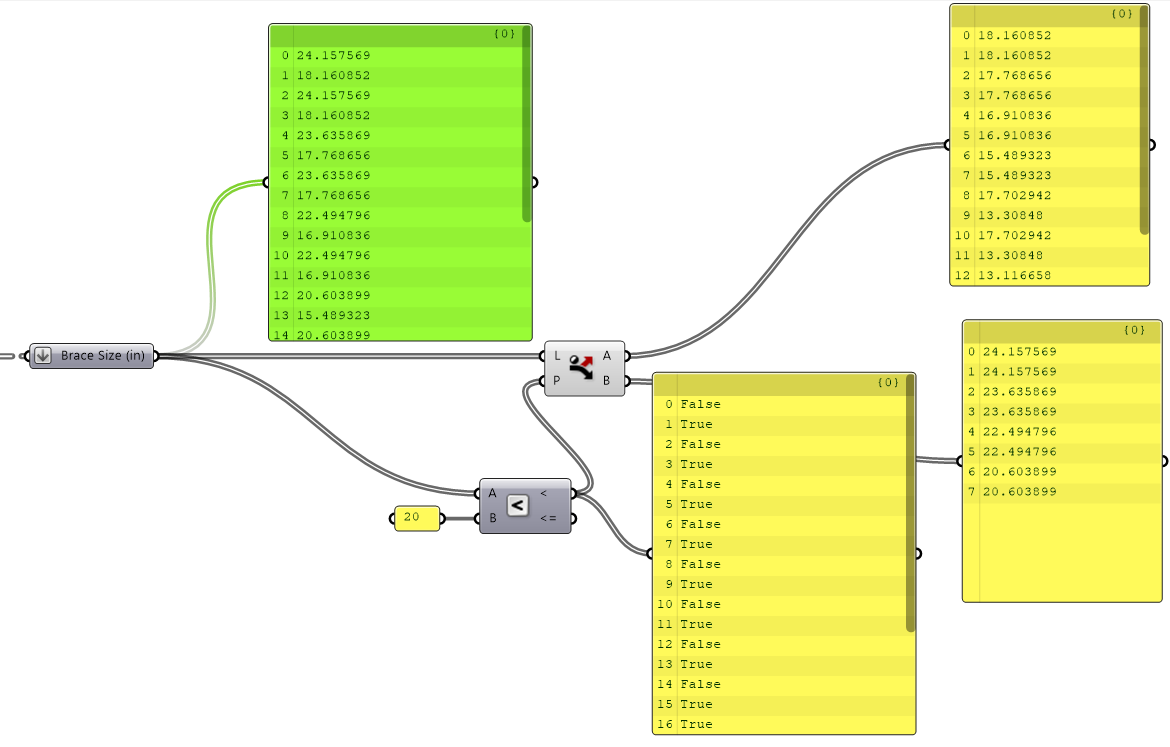
I am just wondering how to classify the data by specific value. For example, I want the points that are smaller than 0.5 to be red and the larger to be blue. I tried to use the “smaller than” component but don’t know how to do it at the next step.
The ‘smaller than’ component gives you a list of true/false values, so just feed these into a dispatch component along with your source list and it will split the list into two streams. You can then feed these into their own preview component with the colour you want for each: