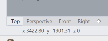
The usability of the coordinate display is a regression from V7.
In V8 it’s not easy to see what the Y/Z values are.
After the axis letter is a space, and the separator is a space as well.
It was much better with the separate panels.
If it’s not wanted to go back to separate panels, then axis names in lowercase and no space after the axis could help.
x11.230 y34.120 z56.412
vs.
X 11.230 Y 34.120 Z 56.412
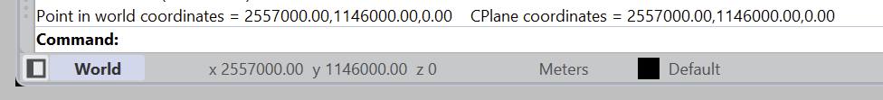
BTW, there is a decimal separator mix in V8, see here:
I just wanted to point out that the capitals were replaced for lower case, and spacing has been improved. I still prefer the way it was displayed int Rhino 7 though. But we’re fighting a bit with available space. I’m not a fan of those colors, but maybe a toned down version could work, idk.