Crackdown Tomb-Raider1-blur20
Crackdown Tomb-Raider1.ini (14.6 KB)


4 Likes
Since I already have a display mode called “Crackdown 20”, my Rhino 7 does not let me import your version. ![]() Perhaps renaming it to “Tomb raider” from this panel in your Rhino before you export the ini file will fix the issue.
Perhaps renaming it to “Tomb raider” from this panel in your Rhino before you export the ini file will fix the issue.

Crackdown 20 TombRaider.ini (16.2 KB)
try now I exported it as .ini file
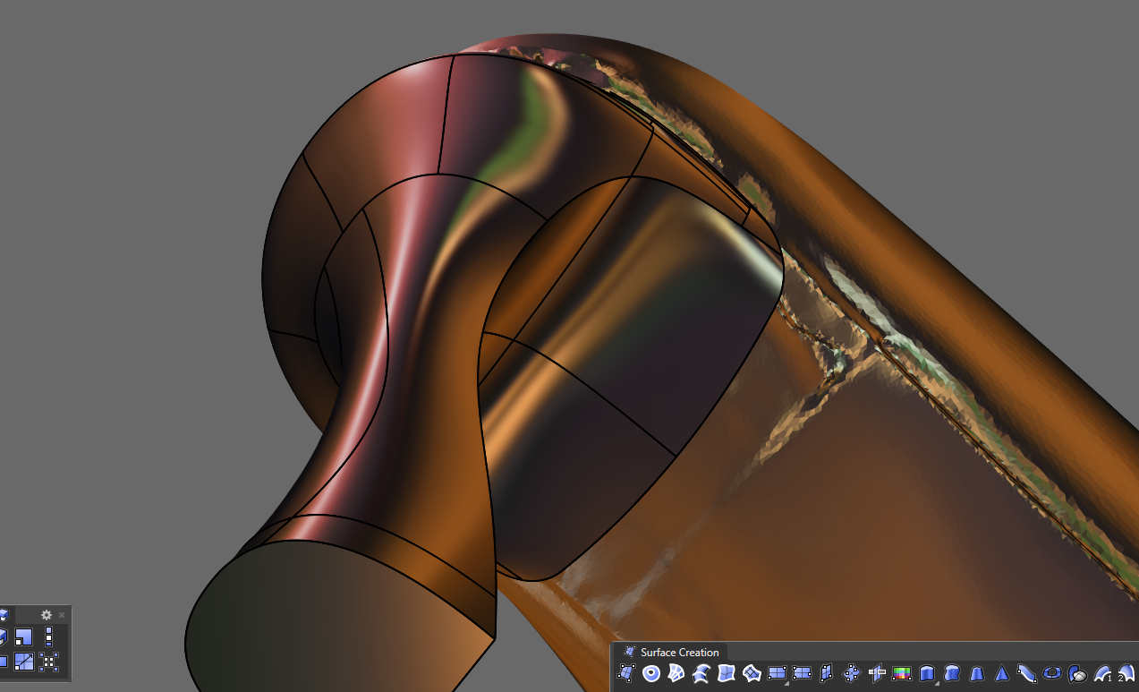
It would be more accurate to have “flat shading” enabled to achieve the PlayStation 1 effect, while without it, it looks like the remastered version of Tomb Raider.
Playstation 1

Playstation 2

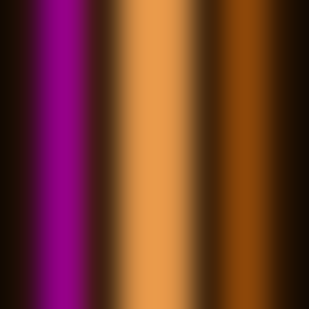
Check my “Tomb raider.png”, which is a very simplified and blurred image of the “Tomb raider” poster you uploaded above. Works well on car body panels.

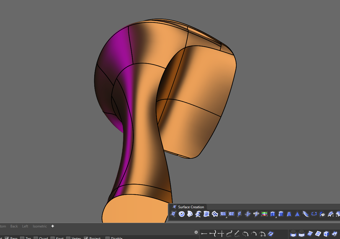
In the initial version, there’s that shade of violet I like, while in your version it’s missing. Could you make one that keeps that color? I really liked the sense of light it gave.
new png tomb raider


What violet? I’m afraid that I can’t see that colour as I’m colour-blind. ![]()


I swear I see it green… ![]()
If you have Paint NET, you can open my image and run the “Hue/Saturation” tool to change the hue level to what you see as red/violet. ![]()
1 Like
Ah damn, don’t worry about it. ![]()
![]()
So the purple I see — do you see it as green? @Rhino_Bulgaria
I’m curious because I need you to clear something up for me, if I show you one of my oil paintings, what colors would you see? If possible, I’d like to send you a photo of the painting in a private message.

Nice experiment ![]()
![]()
I would like to give it a try, but the time to test it is really really little ![]()
1 Like
@Rhino_Bulgaria I am going back through this and am wondering how you made Bobi Arctic have so much better shadows and depth then the standard arctic mode?
1 Like
If I remember correctly, I only increased the shadow intensity. I suppose that the default “Arctic” mode is probably made for architectural scenes, because it looks good on very large models.
However, since I mostly work on cars and various smaller components and product design, I noticed that “Arctic” becomes too bright at up close due to the sudden shift in brightness (perhaps a visual bug or just the way these shadows work?). So, by making the shadows more intensive on my “BOBI Arctic” mode, I fixed that particular weakness of the original “Arctic” mode where the close objects appear almost white and flat.
On the other hand, my display mode looks worse when used on large city scenes, because the shadows get even darker from distance due to the aforementioned shift in brightness.
I also recommend you to try the “Rendered 2” display mode which I uploaded somewhere at the beginning of the topic. It’s close to the original “Arctic”, but have somewhat better defined ground shadows. Here is an alternative version with disabled curves and surface edges:
Rendered 2X.ini (12.8 KB)
A comparison between the 3 display modes:
Rhino’s Arctic:

BOBI Arctic:

Rendered 2X:

6 Likes
You’ve already done so much work - posting your ‘5 favorite’ or even 10 favorite would be useful. One day I’m going to sweep through these and pick out some favorites.
Without you sharing these I would have never guessed what’s possible with display modes.
3 Likes
I mostly use the following display modes:
Set to buttons on my 3d mouse (3dConnexion SpacePilot):
Button 1: Bobi X9
Button 2: Shaded 5 Ultra
Button 3: Light lines 5 Plus
Button 4: '_-projectosnap (toggles the Project)
Button 5: Crackdown 20X
Button 6: Crackdown 17X
Set to buttons on my mouse (Logitech G502 Proteus spectrum):
Wireframe
Bobi X14
Bobi 1
I also use a few more display modes through the “CycleDisplayModes” script:
Car paint 2
Crackdown 15
Crackdown 16
Ghosted V3
Light lines 7
1 Like
Thank-you!! And thanks for sharing the scripts as well.
1 Like
You are welcome!
1 Like
I made 3 new display modes that are quite handy mostly for those who do product design. They are very similar to each other, but have a few minor differences:
“Crackdown 21” is the basic one, with no diffuse highlight and medium brightness to improve the visibility of the control points. It’s easy to the eyes due to the lack of shiny highlights or dark areas, so that makes it perfect for surface examination and long modeling sessions.
“Crackdown 21X” is same as “Crackdown 21”, except that it has an additional white diffuse highlight, in order to make the objects appear more beautiful and shiny.
“Crackdown 21XX” is same as “Crackdown 21X”, but I increased the intensity of the highlight and made the dark areas even darker. The high contrast is good for model overview and presentation, albeit the visibility of the control points is heavily reduced.
Crackdown 21.rar (29.8 KB)

Crackdown 21X.rar (105.7 KB)

Crackdown 21XX.rar (127.8 KB)

1 Like
I’m amazed by how good things look on Windows ![]()
Rhino for mac has super lo-def / noisy / ugly lines and shadows.
