PBR materials and WIP rendering feedback

Hi guys, Good to see that PBR is up and running, but it isn’t very user firendly quite yet.
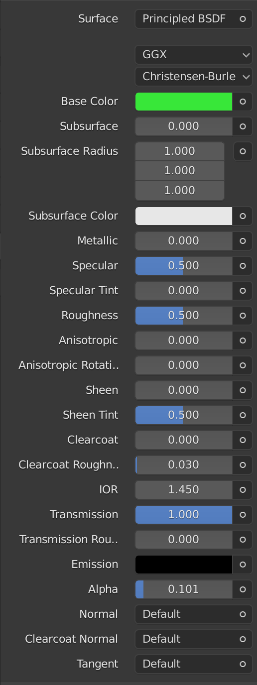
IOR
IF it is going to be physically based then we need the physical settings in the default view.
So having to add IOR settings as an “Effect” isn’t a good GUI idea IMO.

Keep in mind that PBR is for those interested in physically correct materials and the render nerds more than anybody else.

EMISSION
There need to be an intensity setting. Just using color for intensity just isn’t cutting the cheese. That way we can “only” produce white pixles, but not light a room with an object. This is too far from physically correct so please add a Strength setting (simple multiplier) like here:

Here is a simple test in the WIP:
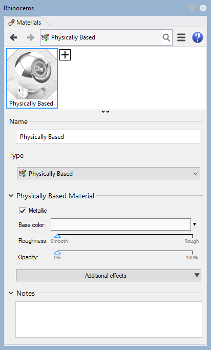
METALLIC
I see that Metallic is JUST an on off toggle and no amount setting. IF that is how you want it then you need to disable the Opacity slider when it is ON. And also update OpenGL preview to NOT show transparency.
OR add transparency as an option when metallic is on together with an amount slider.

UNDOING CHANGES
Guys, when I make changes to the IOR and then UNDO them Rhino responds veeery slow since it is waiting for the material preview to update… that needs to be on two threads so I can rush through my undo’s and not have a sluggish system. Also the IOR settings doesn’t undo

MAKING CHANGES
Why is the slider for Opacity ranging from 0 → 100
when the effects settings for Opacity Amount only goes from 0 → 1?
That to me is inconsistent and should be avoided.

DRAGGING MATERIALS
The drag onto object behavior is turning out quite well but I have an issue with objects that has emissive materials when Raytraced is running. The “Assign” cursor tip is showing but I get the “no object selected” warning and nothing is done. So I have to manually select them and right click the material to assign it.

And that’s all I found while testing it for 20 minutes.

ENVIRONMENT
Intensity setting NEEDS to be on top.
Since we DON’T have a camera exposure setting yet (Angry face) then we have to fiddle with this setting a lot IF we want to take rendering seriously. And therefore it should be on top so it is visible.
As you can see it is now hidden unless the panel is large. So please pop it above TYPE IMO.
image

AND the preview icon background and objects should be the same (or at least similar) as for the material editor IMO so we have material and lighting adjustment similarities.

RENDERING LIGHTS
Rectangluar lights need the option to be visible IN the renderer and also in OpenGL IMO.
Now I have to add an an object in front of the rectangular light, turn OFF shadows for that object and then add an emissive material to it. And that is a lot of unnecessary work to get an effect like this IMO:
(But it looks cool good)

OK guys, that was a lot more typing than testing and I FAR exceeded my timelimit. So please invest some time in reading it carefully.

Cheers!

11 Likes

Parent bug is https://mcneel.myjetbrains.com/youtrack/issue/RH-56557

Jorgen

This is now under way - thank you for the excellent feedback.

About the environment intensity - you mention that you would need camera exposure. I assume you are talking, here, about a multiplier that affects the base brightness of the image. Is this correct? Are there any other controls that you would like on a post effect that would do basic image adjustment?

  • Andy

Also, I don’t get your point about Metallic and Opacity. You seem to contradict yourself…

Right now if you want to tweak metallic more than just the checkbox you need to add the “Base Metal Roughness” additional effect.

Edit: Hi Pascal and Nathan!
Sorry for the short post, in a hurry here :slight_smile:

I’ll try again.
At least in Raytraced Metallic does not support any transparency. So that option should be disabled when Metallic is on. (But I would prefer a % slider for metallic amount)

1 Like

100% metallic means 100% opacity. But if you set lower to say 20% metallic then you can see decreased opacity.

1 Like

Hi Nathan, I seem to explain my self poorly :slight_smile:
So please bear with me.

What I am trying to address is the trouble with the GUI where it has a simplifed version on top (Much too simplified I try to argue) where Metallic can be toggled ON and OFF, but has no value settings.
(Same goes for Opacity, only a slider, but no IOR value). and then we need to add the control for this through something called “effects”.

So here is what I react to as a new user and as a designer:
This material type is called “Physically Based” so the terminology should be there after. If it was called “Physically simulated” then I could accept “Effects” as terminology, but in a physical world they are not effects, they are values of properties that all materials share IMO. And this must be right because we can not toggle them on and off, only “add them” to unlock the values that the materials already has.

Personally I expect an elaborate menu when choosing PBR, not an even simpler than the simplified material dialog from V6. IF PBR is to be the new default then I can see the idea behind making a simple base gui though. But only if it fully and seamlessly replaces the old default material.

So IMO it would be much better to just call them SETTINGS and when clicked it expands all values at once. ALL, so drop the add effects thing all together. have them expandable so we can choose which ones to expand and which to only have as headlines.

And IF there are effects to be added that are not base properties then it would be good to have an extra option for that, where we can toggle those on and off as well.

I have some good ideas on how this can be solved as an intuitive GUI that should be quite easy to make.

So if you are interested then I am willing to spend an hour to make you a dummy in photoshop.
(But if you are not then I won’t waste that time :wink: )

4 Likes

Jorgen

I don’t think it’s correct to say that Physically Correct materials are only for render junkies…I fully expect general users to use PBR too - because it’s actually a much easier model to understand that the old Blinn model. So that’s why we have, and will keep, the simplified UI. IOR is coming. That will bring it pretty close to the same functionality as custom - just with a different (Metal/Roughness) model.

I know you “personally expect” an elaborate menu when choosing PBR. Please try to remember that you are not the only target user.

As for “Effects” - I’m fine with changing it. If we can come up with a name that keeps everyone happy. I don’t like settings all that much, because they are really “Settings groups”

Finally - the terminology “Physically Based” is actually an attempt to disown actual “Physical Simulation”. In reality, “Physically Based Rendering/Materials” or “PBR” is a new standard way of giving artists control over a bunch of parameters that seem to do a decent job of replicating measurements from the real world. There is no “reality simulation” here - it’s more of a new standard.

I know this is super weird. I don’t like it either.

  • Andy
1 Like

I’m thinking that Cycles is wrong here. I accept that fully metal materials, by definition, do not refract light. But we still might want opacity here - more in the form of “cutouts” - or alpha transparency.

So I don’t think removing the controls for opacity is the right answer.

1 Like

If we want cutouts/holdouts or something similar that rather be done in a PEP then IMO.

Re the term “effect”, maybe better word here would be “property”?

1 Like

What I don’t understand is why McNeel tries to reinvent the wheel with this material interface. I agree completely with @Holo that the way it is done now makes no sense.
If a user wants to make a pbr material then all the controls that are necessary should be there in the first place. So that there is no confusion about what to add or not to add.
Metalness should not be a on/off thing but going from no metalness to full metalness. Or controlled by a bitmaptexture. This is how the pbr controls are supposed to work. Take other render engines implementation as example and work from there instead of doing something completely different.

1 Like

Hi Andy, both yes and no, I try to look at this with the eyes of a new user. I learn odd logic fast so I am OK, but having taught Rhino for many years I predict this to be a logic that has to be explaind to every user in much more detail than what should be necessary IMO.

And as Gijs says look at other renderers and see how they handle this industy standard. Rhino should be as similar as possible on every aspect that is well handled by those.

(sorry for not having more time today, deadlines on the horizon! :slight_smile: )

Just a FYI and for fun the Principled BSDF shader node UI in Blender:

1 Like

And this is apparently from 3Delight:
Close to what I envision, all parameters available, condensed and expandable to show values.

And here from Mari:

1 Like

I know nothing about rendering, so I want my own tab. And I’d be happy to see professional render experts having their own tab. Or in other words, a HOLO tab.

Just don’t forget to make a separate a RIL tab for my level of, or lack of, expertise. :slight_smile:

Short version: It doesn’t have to be either or, it’s perfectly fine to have both a simplified and a more detailed interface (two tabs). Drop down sections as a strategy for simplification really isn’t the same thing as a separate tab for experts, because a dummy user like me would think that I should somehow drop down a section, any of them, and believe that I’m suppose to know which one, and worst of all, start fiddling with them. Only to end up being totally lost and start looking for a “restore to default” button… :wink:

Two tabs.

// Rolf

And what happens, RIL, if you get a model that has a bunch of advanced materials?

I disagree. We can improve the sections thing so that it works better for Jorgen and Gijs. For example - a button that opens all of the sections immediately, and.some cleanup of the UI widgets.

2 Likes

I absolutely guarantee you that if I were to present these kinds of UI ideas to McNeel and or the average Rhino user that would absolutely freak out.

Far too much information. No hierarchy.

Sure - I’d use it. Jorgen and Gijs would use it. But 95% of Think users would string me up.

1 Like

I click the HALO tab, install TeamViewer, and call HALO… :wink:

// Rolf

1 Like