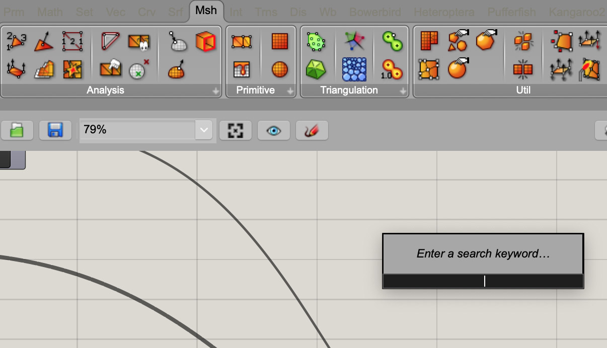
Menu and search field show no contrast/are hard to read, might be due to macOS Mojave dark mode implementation, see attached.
Thanks, I see that too. Logged in:
RH-50352 Grasshopper: Toolbar text difficult to read in Dark mode
This should be fixed in the latest RhinoWIP. Is it more legible now?
Thank you, Dan. Yes, fixed.
(A minor point remaining is: text on sliders etc. is white whereas the background of the slider is a light grey. Very much legible, but would probably better to retain black text)
Thanks very much!
1 Like
Sorry, I don’t follow here. I’m in Dark mode on Mojave and I see this:

I’m color-blind, but that looks like black text to me.
I’m probably being dense. Perhaps a screenshot would help.
@dan, you may not have seen the issue because it’s still in needs testing, but it was fixed after the dark mode updates via RH-50629.
Whoops. Yep, no wonder I didn’t see it. Thanks Curtis!
Yes, fixed in the latest update.
Thank you!