Hi,
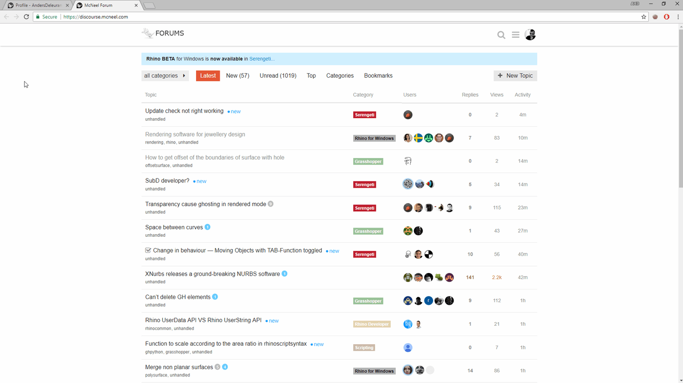
at the moment each post get the category shown and so it’s more difficult to get an overview over the posts. Is it only me or is it a new look? Is it possible to disable the category name at each post?
-Micha
Hi,
at the moment each post get the category shown and so it’s more difficult to get an overview over the posts. Is it only me or is it a new look? Is it possible to disable the category name at each post?
-Micha
About an hour ago. I liked the old way better. 
Yep, interesting change. It feels crisper some how. I’m sure most of us will adjust.
I strongly dislike the new “look”. It’s inefficient and confusing.
Please change it back or make an option to change it back.
I agree with John. Why fix something that ain’t broke? Just to tick us off?
Hate it.
I obviously have lousy short-term memory because I’m struggling to see any substantive difference from the way it looked yesterday…
I don’t like it either - at all… Too cluttered.
Philip
I don’t have any background on this, but it looks like a U/I “face lift”, by a Web page designer, that doesn’t actually use the tool in “the trenches” like we do.
@sam Help! We need to be able to turn this new version off…
Oh, by the way this seems like it’s bein smartphone driven to have a more vertical, scrollable layout… ugh.
I liked the previous version more 
The Light (Compact) theme sorta works okay (or better at least) with this new feed layout (see this thread). But yeah, the (or, my) eyes are really drawn to the colored category boxes instead of the topic title headline. And the compact theme is arguably still a wee bit too compact and has odd white spacing 
Not a big fan of it either. It draws attention to things that aren’t that important.
Yes, me too.
Well, maybe not always, but from quite some time …
I remember that I noticed how many Grasshopper posts appeared here when its Ning forum was closed.
Ah OK, I must have forgot that … Thanks !