I consider the cleanup of the user interface the most important enhancement for V6. The reason I say so it that I often run into Rhino prospects who had attended our free Rhino Introduction seminars and didn’t buy it because they were intimidated by the large number of icons. At a recent jewelllery trade show a man approached me and said that after attending our Rhino demonstration 10 years ago he decided to give it up due to high screen complexity. I showed to him the RhinoGold GUI nd he responded that he could use that one.
Customization of GUI by resellers will never work due to the amount of work involved in maintaining it for the customers.
The major problem I see with the existing GUI is that there a a lot of duplicate buttons/toolbars which create the perception of a larger number of them and make the screen confusing. For example, the Pan button (which is redundant anyway) is in the Standard Toolbar, in the View Toolbar, in the SetView toolbar, etc. So when the user opens the View toolbar, they see an overwhelming number of tools out of which only a few are unique.
There are also inconsistencies. For example, layers can be managed from the panels and from the status bar. But there is also the Layers toolbar, located far from the other two - it would make sense to open it by right-clicking on the layers in the Status Bar.
The supermarket approach of placing the same product in different places so that the customer may accidentally run into it does not work here. Any alternate locations of the same tools/toolbars create confusion, clutter the screen and require additional learning.
This is a really tough problem to solve. Jewelry plug-ins like RhinoGold and Matrix can design user interfaces for specific sub-sets of our users. But we don’t have that luxury.
How would you change the GUI to work for all the customers you sell to? Perhaps we’re too close to it and can’t see an obvious solution that would work for everyone.
I think you might be picking on an exception here, rather than the rule. To be fair, there are over 1000 commands in Rhino. No matter how you slice it, that’s a lot of tools. I imagine if I walked into a machine shop with 1000 tools hanging on the walls and in drawers I’d feel overwhelmed. Well, honestly I’d probably start to drool, but then get overwhelmed when asked to make something.
We’ve always wondered “are there a few tools that everyone always uses?” and “Could we hide some of them?” and “Are there some that nobody ever uses?”
Early in the Rhino 5 WIP process we started collecting statistics about command usage. We didn’t do it for very long, and arguably we didn’t process the data very well. But what we found was that people always used Open, Save, and Undo. After that, there wasn’t a huge overlap. And even tools we thought “people never used” did get used.
Again, I’m interested in hearing how you’d rearrange the UI to make Rhino better for all your customers.
It’s not as tough as you think - it is just a matter of cleaning up and organizing the toolbars. There are a lot of commands in Rhino and there should be a tool for each one of them. But the same tool should not be duplicated in different places, since every duplicate looks like a new tool to the inexperienced user and it clutters the view of the toolbar. Let me show you an example of difficulties I encounter while teaching Rhino.
While teaching Rhino, when I get to view manipulation, I explain the importance of it, since regardless on what they do they have to manipulate the views and if they don’t know proper tools, they will be slower.
Since the training manual only shows them how to use the menus to manipulate views, I try to demonstrate them how to use the toolbars for this purpose. And here is the problem. There is a whole bunch of relevant tools in the Standard toolbar and three flyouts. First I have to tell them to ignore the Pan and Rotate View tools, since they can do it with the mouse. Then I show them the next four tools (zooms) and then I open the View toolbar, which shows the same tools I was just talking about, mixed with a few new ones. At this point I can see I am already loosing them, but it gets worse - when I open the Set View toolbar, there are again most of the tools I already covered plus a few new ones. I can tell which ones are the duplicates and which ones are distinct, but they can’t distinguish them and they are completely confused. At that point I know that they would use the menus (as shown in the book) and forget about the toolbars altogether.
Using this example, if I were to customize the GUI, I would eliminate the duplicate tools and use only two toolbars, one to set views (and nothing else) and another for everything else (but without the tools already shown in the Standard toolbar).
There are some other changes I have in mind which don’t require much effort - just a little ‘housekeeping’. Here is an example where I would like to have the Layers toolbar open, with the right-click on the layer pane.
I’m confused. Your suggestion seems to be to eliminate two toolbar buttons from two flyout toolbars each. Thats fine all by itself, and may be the right way to go - but you started this thread with:
While eliminating 4 of 1000 buttons is a start, I doubt it will make any difference at all for your prospective client.
Perhaps this customer needed RhinoGold or Matrix all along?
for perspective, what software did the guy end up going with?
as in - was Rhino UI too intimidating compared to another software which he found not intimidating and he still uses 10 years later?
-or-
is it more like all 3D software in general is too intimidating for him and although he may be intrigued by it, he doesn’t actually do any 3D modeling?
Housekeeping will not improve the situation. To use the Layers example take a look at those 12 icons, about 2 of them are understandable (maybe) and the rest, it’s anyones guess. There isn’t a reason for the vast majority of Rhinos icons if the interface was optimized for a better user experience. Problem is good UX typically costs $$$, and you need to step out of the echo chamber depending on input from existing users. If Rhino has a sufficiently large install base there’s not a big incentive to mess with it, McNeel can float with existing user base upgrades for people that have invested the time learning the Rhino interface. If they change the UX they risk alienating the existing user base, which takes away a revenue source for them. I see Rhino as a product that will slowly fade into obscurity due to lack of optimization. Will is disappear overnight? I don’t think that will happen.
Keep in mind that the icons in Rhino are only one of 3 ways to using most of the functionality (others being commands and pull-down menu). As users get more advanced many of them rely on a few icons and the rest is either aliases or commands for the fastest workflow.
Hi John - thanks, I tend to agree that it would be good to simplify the UI, but it is actually pretty hard to pin down exactly what should be done all at once and ‘just solve it’. For instance, duplicate toolbar buttons can be useful, even necessary - for example, Rebuild is a single command that works on curve and surfaces and appears in the context of each type of toolset. Cancel, Join, Split, Trim Explode show up in multiple ‘side bars’ because they are always useful for almost any geometry type. Is that bad, in your experience?
I do get that the UI can be intimidating but at the same time, we see comments from users responding to our ‘thanks for downloading’ emails that say how intuitive and easy Rhino is… so there is that pressure to be careful as well. None of this solves anything for you, I understand - I’d say that specific suggestions such as you’ve made are welcome - something we can evaluate concretely. I’d also point out that there’s slow but real progress in some areas that eliminate commands - MoveFace MoveEdge are basically obsolete with sub object selection, Gumball scaling and extrusion,. OSnapping on dragging, also make things smoother and more command-free.
I’d love to see your ideal default toolset, btw. if you’ve made that rui file, I have no doubt we could learn from it.
THEMED UI
I may kick in open doors now, but having read the whole thread it seems to me that there actually could be a solution. And that solution would involve keeping the current UI.
A solution could be to have an alternative, or “pluggable”, UI which entirely replaces the std UI menus/icons etc. Such an UI could then be populated with a setup, filled with the items that would support your workflow the best.
There could even be a dedicated page somewhere where such customized setups, or “themes” could be downloaded. Theme with names like “Simple xxxx” would draw attention from some, while “ClassA Modeling” would attract others. Aso.
To some extent customization is already possble, but not to the extent that you actually can simplify it (or rather, “optimize” it for certain workflows), instead the current solution for customization tends to fill the UI with even more redundant commands.
"EDU THEMES" Edit: Think of the potential for such a themed UI dedicated for specific training courses, for example. Load a theme that holds only the UIs needed to perform the training task… wow. Or, even “Intellisense UIs” that adapts depending on what objects you are working with (and override with Something+Shift, as with Ortho, to restore a basic theme). Aso.
First thing I do when I install rhino on a new machine is chop a heap of icons out of the toolbars; mainly to remove duplication. I tend to have the standard icons condensed into 3 rows at the top (most of which I call up via text input anyway) then the sides (both sides) are only the icons for my growing list of plugins; which I use less frequently but so often the command line ‘command’ for the plugin commands is too clunky or requires that I stop mousing the model and scroll command options.
I’m also slowly finding commands that I never use and removing them from toolbars all together too…
All that said; I wouldn’t call myself a Rhino power user.
You don’t need to be defensive Brian. Rhino has a great interface as it is and I always try to convince our customers to use it instead of RhinoGold’s one or Matrix (both of them have limitations). But since there is always room for improvement, the work on Serengeti is a good opportunity to make it even better and easier. I think removing 4 buttons out of 32 in the Standard toolbar is a good start.
I like the Rhino GUI - I consider it logical and intuitive and I do not advocate to replace it.
My suggestions are based on the feedback and interaction with hundreds of users I have taught :Rhino over the last 17 years.
I prefer to teach all my students how to use the default Rhino interface regardless whether that want to use RhinoGold or Rhino. It would help to make it easier for them.
Most of my customers use Rhino as it comes - they are busy with learning Rhino tools and they don’t want to venture into customization.
I do not customize the interface to avoid confusing my trainees who may then install their Rhino and see something different. However I can’t resist deleting some redundant buttons from the Standard toolbar. Then I have to tell the beginners how to do that and when they go home they end up loosing the whole toolbar since they don’t remember exactly how I did it, etc. It would be better if those redundant buttons weren’t there in the first place.
I would not change much in the Sidebar other than remove some obvious duplicates. So if the Array toolbar is accessible directly from the Sidebar, it doesn’t have to be in the Transformation flyout (from the developer’s perspective it looks nice to keep all transformation tools there, but for the user it creates an information overflow). I would also move Miror to the Sidebar and add Mirror Horizontal/Vertical next to it (they are used very often).
As a Rhino old-timer, I don’t find much use for the tabs in the top toolbar. Some of them change the Sidebar, others don’t., but none of them show the frequently used Undo (it should be always accessible, preferably in the same place). Wheres I can easily explain to my students the logical flow of toolbars accessible from the Sidebar, I have difficulties in the logic behind the top tabs - may be I am missing something. For example, after clicking the Curve Tools tab I see a completely different user interface, showing all curve-related tools. While I can easily recognize them, I still have to find them since they are in a different place than when accessed from the Sidebar toolbars. It is more so for my students who often memorize the location of the buttons when accessed from the Sidebar toolbars.
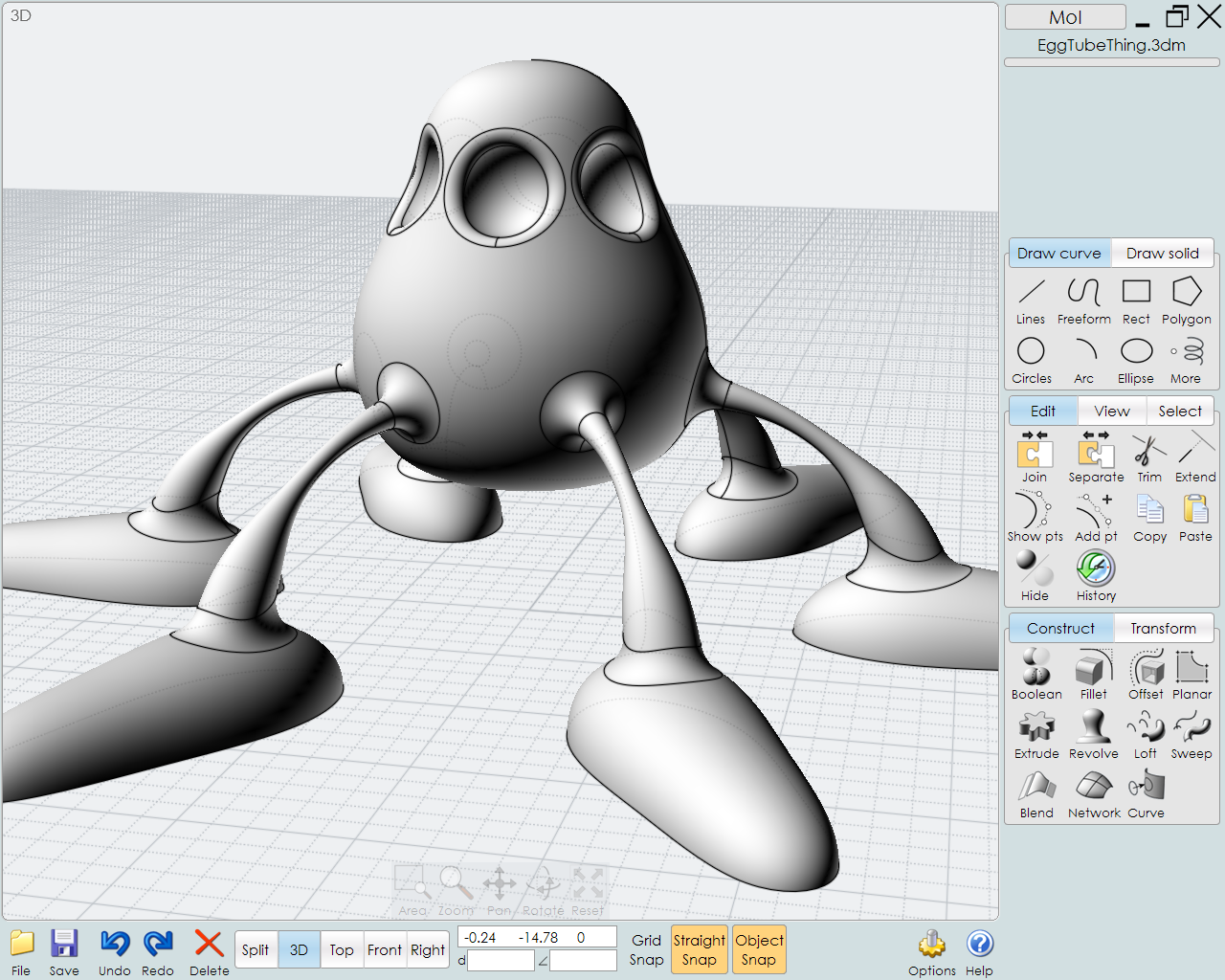
Below is an example of the Standard toolbar after removing the tools that already exist in its flyouts (I moved the Layers toolbar to the bottom of Panels pane):
Since I am very busy, I won’t be able to create an ideal toolbar - I think you guys will do a better job with it anyway.
I don’t think this must be the case …
For example, I’m used to use Rhino with its original toolbar collection closed.
I use instead a custom toolbar collection with buttons both from the original Rhino toolbars and custom-made (to run scripts and macros).
Rhino’s toolbars are completely customizable, but that requires quite some work, yes.
If you’re talking about easy customization, OK, I agree. Customizing Rhino’s UI is not very fast and easy, and you have to know in advance what to do. It’s not something any beginner can do.
About the topic in general, I’d say that what Rhino UI lacks is organization.
Buttons (i.e. commands) are not clearly organized into sets and subsets that could help new users in finding their way to what they are looking for.
Compare Rhino’s UI with Grasshopper’s UI.
OK, commands are not components, and there are much more Rhino commands than GH components, but still I think that a hierarchical organization of buttons might help new Rhino users.
I have to respectfully disagree. Although there are certain areas that should be made better in terms of gui I don’t feel the current interface/interaction needs to be changed or icons need to be deleted.
I’ve been working in 3dsmax and 3dcoat and they have hard to find areas and many mystical areas that only show under certain conditions, though less icons in the gui the amount of mouse clicks to get things done is much more and it’s way more confusing than rhino, watch the 3dsmax tuts on the web you see these expert creators many times struggling to find things in the max gui, this is not the case when one knows Rhino to the same extant. Going back to Rhino’s gui is a joy it’s really a work horse. You as a reseller know some of these people who are intimidated are judging a book by it’s cover, you might merely need to convince them of the advantages of the gui and sell them on it’s strengths. For instance show them the strengths of the good old command line, not many programs let you see the commands you issue in action this itself is gold for a user. Many users don’t even click icons they type so fast they can compete with any gui not many programs let a user interact with the program in all these ways. The icon interface looks oldish but look at windows 10 it really looks like windows 3.0 with the white title bars etc. And customizing icons is not hard it’s easier than in office or other programs.
But I know the public is a hard nut to crack not an easy place to be as a reseller.
RM
Yes, but with UI I meant all of it, like Menus, Status bar, everything. So, if making a custom toolbar you still “add” you don’t reduce or simplify in absolute meaning (menus are still there, etc).
A complete themed customization would include all parts of the UI.
No, not necessarily. It takes what it takes, but there would always be someone who’s defining a decent setup (theme) that could be shared with others.
True. That’s why I mentioned a site or a common page where users could share complete themes.
Also McNeel could provide different “themes” suitable for different workflows or user categories without having to destroy the existing basic set of commands spread all over, which would always be there as a (temporary) fallback, if need be.
A key-combination for temporarily enabling the std theme would come to rescue if the specialized theme wasn’t enough at some point.
In any case, the underlaying “business logic” (core) should be strictly separated from the User Interface as to allow for any kind of UI/APIs utilizing the “core” business logic (a separation which probably already exist).
Undo/Redo, along with Save/Saveas and possibly one or two others should either be included in the same position in all of the toolbars or in a mini toolbar of their own which is always visible in addition to the others.
I don’t use the tabs either. I personally think that introducing them was a bad decision - sorry guys…
Yes, this is not good at all - IMHO. I like to have the same command/icon in the same place - always. It should be easy to find them “geographically” - without looking at the icons


