Hi,
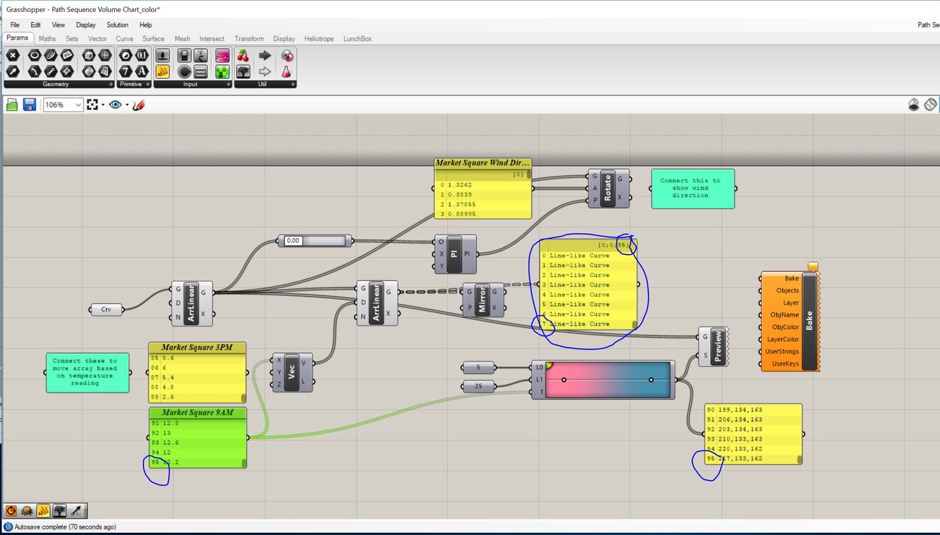
I’m using Grasshopper to generate simple visualizations of temperature and wind readings I have taken from a study site (see image). I am representing the sequence of data readings as an array of lines, in which the distance of the offset for the array is based on a temperature reading. The hotter the temperature, the closer the lines. The result is a pattern symbolizing gradients of temperature change as I walk through space.
I’m using lunchbox to apply a color gradient to the array. The problem I am having is this: I have 96 data points in my data collection. I use this data to create values in a color gradient. However, I have 768 lines to apply this data to (96 for each data reading, which are then arrayed 8 times each to create the pattern). Is there a simple way for me to apply the 96 color values to the 768 lines (96 branches with 8 items each)?
Thank you!
Path Sequence Volume Chart_color_internalized.gh (20.1 KB)