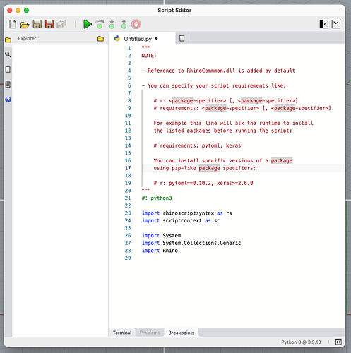
Here’s how it currently looks on macOS.
When you first open the editor, you get greeted by a weirdly empty window. I would prefer to have an empty text editor window, where you could already write in or something.
Or why not simply offer options to create a document or open what’s been recently worked on in a friendly manner here, instead of having to click on the new file icon first?
When you open a new script, say Python 3, a whole bunch of boilerplate code gets inserted.
I hope the template for this is editable, since deleting most of it every time you open a new script will get old quickly.
I would also prefer if the icon clutter could be reduced.
Are three save icons really necessary. I would hide the “save as” button "under the “save” button and make it revealable with CMD. I don’t know if a “save all documents” button is all that useful to be honest.
The three buttons concerning breakpoints and debugging could be hidden as long as there are no set breakpoints. Or simply put them into the lower collapsible Breakpoints tab.
I would also prefer if the side bar icons were removed. The side bar could be expanded and collapsed by clicking on its icons instead.
“Find and replace” would be better placed outside of the side bar on top or below the script editor or even as a pop-up window. Users that don’t want to use the sidebar features would not have to pop it up and close it when done.
It would also be great if you could cycle through search result that yield more than one hit. Other programs let you hit for instance Enter while still being in the search box to go through the results.
Like Anders, I would prefer to move the side bar icons to the lower section of the window.
The new script editor is obviously a big improvement over the existing one, especially on macOS.
The above mentioned points are meant as friendly, subjective, possible improvements.

