Hi,
I have organized the menu in App based of the names of groups names from Grasshopper definition - and I like this more than using containers which makes my definition more complicated. I used uppercase for the group/menu names in order to easily differentiate by the commands inside a group. But it is still difficult especially when few menus are open. I don’t know if iFrame colours (primary -secondary,..) are useful here. How can I use different colors for the group names and for the commands inside a group. Or any idea to make easier the rapid navigation between different groups and commands? Hope I have explained enough clear my problem! Thank you

You can play with the styles in your App by creating a theme file, as explained here. Customize a theme
It will soon be possible to do this from the platform, making the process easier.
Hi @mathieu1,
It is too complex for me - I don’t understand it!
I think I’ll wait to do it from the platform
Sincerely
Hi @mathieu1,
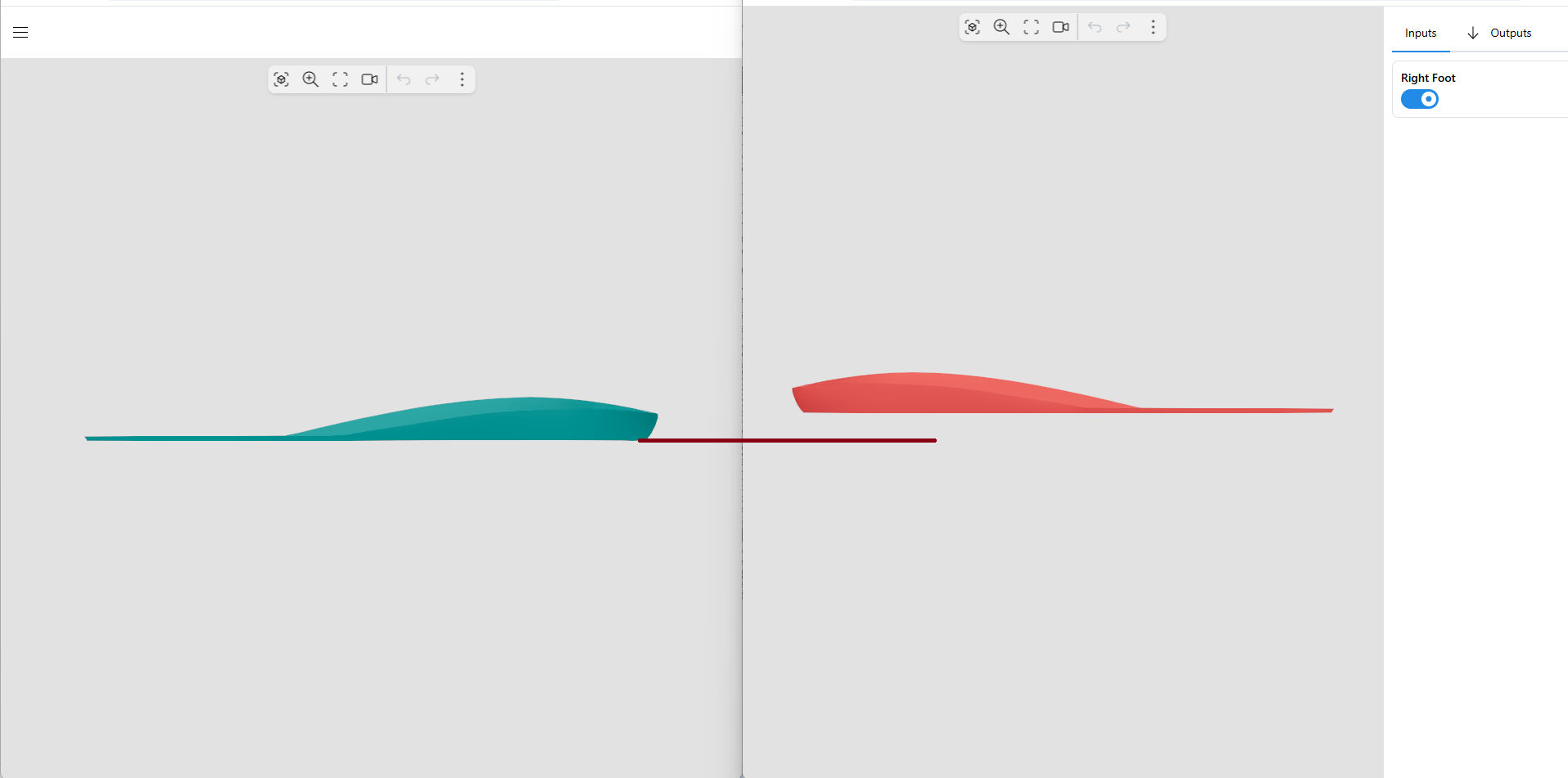
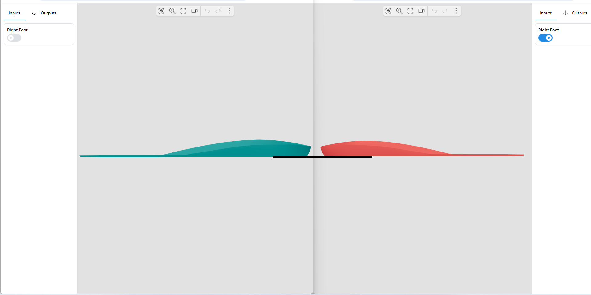
My Grasshopper code can design a single foot orthosis: left or right. If I open App in 2 different windows then I can design simultaneous both left and foot orthosis But as you can see in the ‘original’ image the the foot orthosis views are separated by the menu because this is all the time on the right side. There is any possibility to change the menu position on the left side as in the ‘modified’ image (which I’ve done manually in Paint…) while keeping the menu generation based on the names of the groups from the Grasshopper code?
Thanks!


It seems like you are building Apps using the gumball component, but without using the App Builder components which allow you to customize the layout of you Apps. You could have a look at this article explaining the concepts of App Builder. In your case, you could simply build an App where all your parameters are added to a “left” container instead of the default right.
Hi @mathieu1 ,
Thanks - I try to read the article carefully!
Thanks


Just done this and wanted to tell you I’ve solved it!
Thank you very much!
Hi @mathieu1
My menu will change the position to left or right side of the viewer as a function of the foot on which I work. I want to include the export options in a tab which will stay all the time next to the other tabs. In this way, working on left foot means all tabs are on the left side. This way, opening 2 sessions I can work simultaneously on 2 adjacent viewers which has nothing between them (like in the image from post no 4). I’ve defined 2 tabs: ‘Inputs’ and ‘Outputs’
But I don’t know why the export command doesn’t appear in the ‘Outputs’ tab!
Can you help me with an advice? Thanks
ExportMenu.gh (103.4 KB)
Hi @mathieu1 ,
The tutorial ‘Link Export components to image widgets in your apps.’ (https://help.shapediver.com/doc/shapediver-app-builder) helped me to solve the problem of ‘mobile’ export options!
Here is the solution:
ExportMenu.gh (101.7 KB)
Thank you!
Hi @mathieu1 ,
Now there is another problem with menu position!
I’m opening the same Grasshopper definition but in 2 different windows in order to work left foot in the left window and the right foot on the right window. But when I modify windows dimensions the menu from left side doesn’t behave like the right one. I need one window to be a mirror of the other with the menu visible no matter the window dimensions.
Hope my explanations are Ok!
Thanks!
For now, the width and responsive behaviour of the left container can only be controlled through the json theme file. There are two relevant properties: the navbarBreakpoint, which defines at which screen size the left container is minified, and the navbarWidth, which defines the width in pixels of the container.
I know you do not feel comfortable playing with the theme; this will become easier in the future once we implement a theme editor. For now, I uploaded an example for you where the breakpoing is set to xs (very small screens) and the width to 250 pixels:
https://shapediverdownloads.s3.us-east-1.amazonaws.com/customNavbar.json
You can just apply this theme by adding the following at the end of your left foot app’s URL:
&g=https://shapediverdownloads.s3.us-east-1.amazonaws.com/customNavbar.json
Let me know if that works as you want it to, otherwise I can update some of the properties to match your expectations.
Hi @mathieu1 ,
Thank you very much! Here is a simulation based on your suggestion. What I can see is the left container is minimized at a higher width of the window. For sure something similar have to be done for the right window in order for the container to stay all the time on the right side and not to go under viewer as you can see
It is obvious I’ve to study about how to implement these because I don’t understand anything you did (how have you created the customNavbar.json file and how can I reference it from my Grasshopper code). Any practical example from you it will be of a great help. I’m sure these are simple task for you and sorry for asking you to lose your time with them - but for me are very difficult to understand. Probably I could be able to start and to modify an existing example!
Thank you for your time, understanding and support!
The left and right container in the default template are implemented differently, and it is currently not possible to apply the same behavior to both of them. The solution I gave you should work on a laptop in full screen use (half of the screen for one and the other half for the second App), as your video seems to show. If you want this to work in specific cases and sizes, this will need a different template, which does not exist at the moment. If you tell me more about your goal, we might find a workaround that works for your case.
Why do you need this setup to work if you change the window sizes? What is the use case exactly?
Hi @mathieu1
I have the same Grasshopper code but I want to open it in 2 windows in order to work on the design on the left orthosis on the left window and on the right one in the right window. I want to see clear the design differences (dimensions, shape,..) between the left and right so I don’t need any menu between the viewers and also I need the viewers to be very well aligned to see the differences between left and right - see the attached images
But I also need to control this from the Grasshopper code and as far as I understand this is not possible!
I understand this, but I thought the solution I sent in my message above solved this. Is there a reason why you need to resize the windows to different ratios? Can you not work in full screen with one viewer on the left and one on the right?
If you try to have 2 windows splitting the full screen in 2 symmetrical halves this will not succeed because the menus position is not under control - on the left it will be minimized while on the right it will be placed in the right corner under the viewer

Hi @mathieu1
I checked on my laptop and desktop, and when each window on the left and right (i.e., the viewer + menu) took up half of the full screen, everything was fine - like in your image. When I manipulate the dimensions of the windows the symmetry will be lost with menu minimized or placed under the viewer thought that the viewer+menu will remain constant no matter the window dimensions will be. But I can say it is Ok like it is! Now the question is how can I manage adding “&g=https://shapediverdownloads.s3.us-east-1.amazonaws.com/customNavbar.json” at the end of left foot app’s URL from my Grasshopper code. Because I can’t ask the user to do this - it should be automated somehow!
Thank you for your support!