I am hoping that someone will be able to help me.
I am currently trying to recreate the attached diagram (screenshot) in grasshopper. I have created a grid and I am trying to place some values taken from a csv file on specific parts of the grid, however, I am having difficulties with this as I am not that familiar with grasshopper, it’s for a university project. Also, once the points are on the correct place of the grid, I would like to represent each value with a circle.
I have attached the grasshopper script for reference, as well as the csv file. If anyone is able to help I would truly appreciate it! Thank you in advance.GRID SCRIPT.gh (15.2 KB) number-of-deaths-by-risk-factor DD.csv (2.0 MB)
If I understand your data correctly, you have 20 columns of information for 6,468 rows of data (!?) that covers 231 countries/locations? Is that right? What’s the plan for consolidating 6,468 rows into 231 rows?
At the moment each country has 28 years, ranging from 1990-2017. For the grid that I am trying to create, I only want the list of countries as (y) and the years as (x).So 231 rows and 28 columns.
OK, so then you must choose to display only one column of data at a time from the 17 remaining columns of data? (20 columns minus ‘Entity’, ‘Code’ and ‘Year’)
In other words, from the list of 20 columns below, choose one of the 17 beginning with “Deaths” and display that value for 231 “countries” (one row per location/region) and 28 years (one column per year). Is that right?
Entity
Code
Year
Deaths - Unsafe sex - Sex: Both - Age: All Ages (Number)
Deaths - No access to handwashing facility - Sex: Both - Age: All Ages (Number)
Deaths - Child wasting - Sex: Both - Age: All Ages (Number)
Deaths - Child stunting - Sex: Both - Age: All Ages (Number)
Deaths - Low physical activity - Sex: Both - Age: All Ages (Number)
Deaths - Smoking - Sex: Both - Age: All Ages (Number)
Deaths - Secondhand smoke - Sex: Both - Age: All Ages (Number)
Deaths - Alcohol use - Sex: Both - Age: All Ages (Number)
Deaths - Drug use - Sex: Both - Age: All Ages (Number)
Deaths - High body-mass index - Sex: Both - Age: All Ages (Number)
Deaths - Low bone mineral density - Sex: Both - Age: All Ages (Number)
Deaths - Low birth weight for gestation - Sex: Both - Age: All Ages (Number)
Deaths - Unsafe water source - Sex: Both - Age: All Ages (Number)
Deaths - Unsafe sanitation - Sex: Both - Age: All Ages (Number)
Deaths - Household air pollution from solid fuels - Sex: Both - Age: All Ages (Number)
Deaths - Air pollution - Sex: Both - Age: All Ages (Number)
Deaths – Outdoor air pollution (all ages) (IHME)
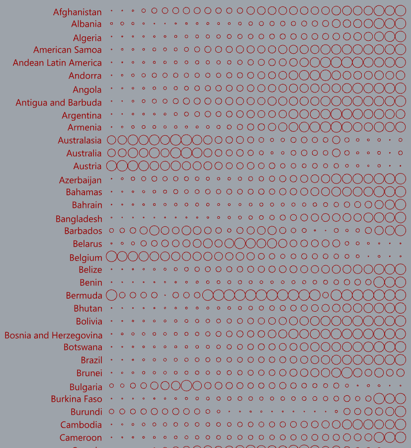
Yes, that’s correct. I will be using the last column (Outdoor air pollution…). I want to show the different levels for each country using circles to represent the different values.
I almost had it but there is some corrupt data causing a problem. Tracking it down… Two countries have a stray quote character somewhere, causing duplicates in my list of countries and garbled data.
"Central Europe
"Southeast Asia
Ideally this should be fixed in the .csv file please?
P.S. Correction: see below - these are comma-delimited values enclosed in quotes but apparently causing grief for the Text Split component, which ignores the quotes?
“Central Europe, Eastern Europe, and Central Asia”
“Southeast Asia, East Asia, and Oceania”
I cleaned up my copy of the .csv file, replacing the quoted strings with “.” delimited names; there were some variations. Now I’m still seeing some insanely large number values and perhaps other data corruption, giving errors converting “text” to numbers. This is a MAJOR distraction!
I’m going to take a break. I’d give you what I have but would rather finish it first.
No, I was wrong about that… This is utterly bizarre but I found a work-around. No idea why it works, maybe some whitespace gets culled? AGGRAVATING but it looks like I can move forward now - after that break I haven’t taken yet.
OK, I was only a few clicks away from finishing this hours ago(!!!) so I deferred my dinner and finished this, though don’t have the patience to format it as neatly as I normally would, or even proof-read it to make sure the output matches the data. Later for that, and maybe some commentary too.
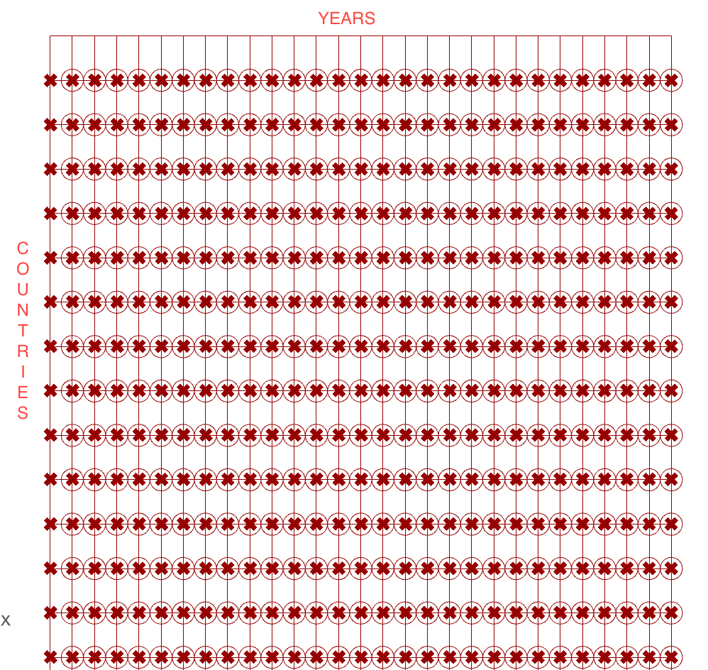
NOTE: The circles are relative only within one row (country/region). You can flatten the input to Bnd(Bounds, white group) to make them relative to all countries but that results in a lot of very small circles due to different population sizes.
The ability to choose any one of the 17 columns of data (blue group labeled ‘Data Set’). The label for the selected column is displayed in a text panel and at the top of the grid (in black).
The ability to choose a location and see 28 years of data values for it (gray group labeled ‘Location Data’).
A cursory glance confirms that the data used to make the grid of circles appears to be correct? It’s worth a closer look to be sure but I’m annoyed about spending way too much time on that mystery bug and am done for tonight.
Thank you so much, you’ve helped me a great deal and I truly appreciate it!
If its not too much to ask and if you have the time:
Could you explain what you’ve done as I’m unfamiliar with most of those plugins and I would like to understand it for myself.
Also if I wanted to list each year at the top, similar to how the countries have been listed at the side, how might I do that?
And I’m not sure about this, but is there a way for grasshopper to highlight with colour the country that has the highest level (so the circles in that row) and the year that had the highest level (the circles in that column) to see if and where they overlap?
Again I truly appreciate the help you have already provided me with.
I didn’t use any plugins so I guess you mean the standard GH components? Most of the “magic” happens because of Member Index(MIndex), now in a green group. There are several ways of using it but the pattern I used here is documented on this thread:
I’d be happy to answer questions about this code (after I have some coffee!) but it’s actually not that complicated and quite a lot can be learned by plugging in some text panels and examining data trees.
Yes, I wanted to add the years above each column yesterday but was exhausted by the distraction (in the gold-colored group labeled “WTF?” below) and have done so now. See the purple group labeled “Year column labels”.
Remember that the gray group at the bottom can be deleted without affecting the code. It is labeled “Location Data (DEBUG TOOL, not required)”.
As to highlighting the country that has the highest level, that might be complicated for two reasons:
Data tree organization - I’m not yet awake enough to tackle that.
Groups of countries and ‘World’ will always have far larger values than individual countries. You can see an approximation of what you’re asking for by flattening the input to Bnd(Bounds, white group) to make all the circles relative to each other. As you can see, ‘World’ and a few other aggregate regions have the largest circles while all the others are very small:
If I was to remove the world and other data that’s not a country from the csv file, would I need to adjust the grid somehow or would it update automatically? Also would removing these from the csv file help with identifying the highest level of pollution for country and year?
Yes, it should. See the List Length(Lng) component wired to the ‘Extent Y’ input of Rectangular.
It would eliminate the extremes caused by aggregating countries. You’re welcome to try it with the flattened Bounds as suggested before. I’m not ready yet to look at the highlighting, maybe you’ll have a new data set before I do.
I need to understand this better. Are you suggesting that the row and column of circles designated by the highest overall value on the grid be highlighted? The image in your first post shows just one column being highlighted, suggesting you choose a year (column) for highlighting and then perhaps color the circles in that column based on their (radius) values?
I’ll need to be convinced that any highlighting is superior in some way to what you see now when you flatten that Bounds input?
P.S. By the way, if you choose a different ‘Data Set’ column such as 12 (‘Deaths - Unsafe water source - Sex: Both - Age: All Ages (Number)’), the numbers are REAL with 14 decimal places(!!) instead of INTEGERs - why? They could be rounded off to one or two decimal places, eh?
 Now I’m still seeing some insanely large number values and perhaps other data corruption, giving errors converting “text” to numbers. This is a MAJOR distraction!