I set up a high contrast Windows theme from here on the advice of @Asterisk
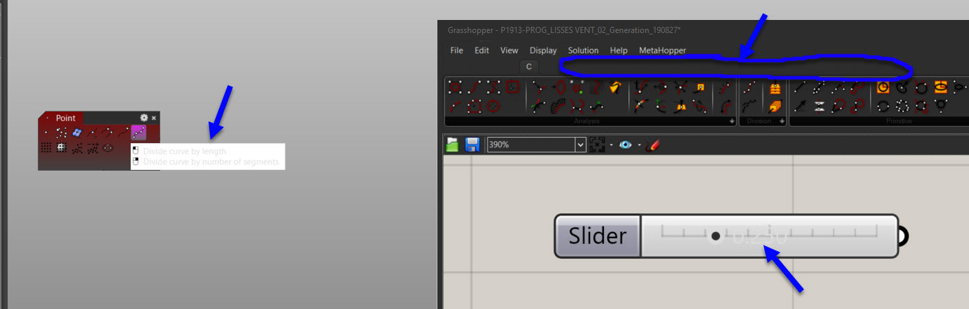
I’m mostly happy with it in Rhino (apart from the tooltips which are barely readable), but I find that in GH, the tab titles don’t follow the assigned color for the text ; they stay black, and therefore become un-readable with a dark background.
The opposite is true with the sliders : the clear text color is used, but since the background is grayish, it’s hard to read too.
To summarize, if one wants to gain control over the Rhino interface aspect, one needs to :
Set some colors in Rhino Options / Advanced
Set other colors in RhinoOptions / Appearance / Colors
Set yet other colors in the Windows Registry
Finaly set other colors with “Windows Form” (if that is actually possible)
This is why I’ve given up.
Since the interface is likely to remain essentially the same in Rhino 7, all I can do is to keep hope for my children or, more realistically, grand-children.