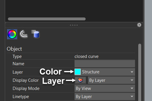
Am I the only one who confuses the Layer and Colour properties all the time now that there is the usual “Layer” icon next to the Display color ?
So you have a color button for layers (like before, actually), and a layer button for colors.
I’ll probably get used to it after some point, but… silly or what ?
A bit silly. I’d say more like counterproductive because the Layer icon (a slice of red, white and blue pie) is colored, and it’s the object’s color that should display next to “Display Color” instead of whatever the layer icon happens to be in the UI (which I’d rather not have to memorize/internalize).