A number of simple things making a  's life so much easier :
Wish #1: Data Description
I found it being extremely useful to use the “Data Description” component from the Elefront plug-in in all my GrassHopper implementations. Which hints that it’s a generally useful component to be added in GH2 as a std component (although Elefront is - plug warning - is a very useful plug-in, and I use it a lot apart from the Description component, it is not so good if every project should involve 3rd party plugins for the most trivial things).
Fig. 1. This Elefront component (plug!) gets my +1 for introduction into GH2:

Edit: Answering a question in the thread below, the idea with the component is as follows.
Fig.1. Example of a “chained path” made with description components, starting in the upper left corner, propagating the same name down-stream :

.
.
Wish #2: SphereC/R
Same here, the one component I keep looking for a zillion times a day and… it’s not there!
Fig.2. Sphere Center & Radius component :

I would just love to see a (intuitive) std such component in there.
.
.
##Wish #3: Lock Layout Positions
Canvas layout position locking for individual Components and Groups (locking Group’s components & sub Groups).
Locking position, as opposed to Endable/Disable/Preview etc, is crucial for utilizing the GH canvas as a “user interface” with Sliders, and Toggle Buttons etc.
As it is now the layout groups and components are too easily messed up by the slightest careless mouse move and… well, that’s all there is to it. If positions could be locked the problem would go away altogether.
Sliders and Buttons would of course still work as expected, but they would not be accidentally moved or deleted.
.
.
##Wish #4: LED Diods (R, G, Y)
Yes, red, green and yellow LED Diods. Often I have to “disable” parts of a complex diagram while testing other parts without bogging down the computer with heavy calculations. And when done with the troubling parts I’d like to enable the disabled parts again. But where & which are those disabled parts?
Introduce std outputs on ALL components, including Groups, broadcasting whether it is Enabled or Disabled. LED Diodes could then be assigned to these ports, and from any zoom level it would be obvious where the angry shiny red LED Diodes are located.
Related features :
.
##Wish #5: Enabling/Disabling of Groups
Things related to LED Lights being used as state indicators as mentioned above :
- Add Enable/Disable to Groups, propagating the state to included Components.
- Indicate in the group frame whether the Group area is enabled/disabled (for those weaker among us being allergic of LED lights and thus wouldn’t take on the useless work of attaching LED lights to visibly indicate the enabled state)
- A jump list main menu (+ popup menu) for cycling from LED to LED (or disabled Group to Group) would make it easy for developers to maintain and restore desired groups / parts of the model.
- This feature would, of course, be more important than the LED lights, but I immediately feel I shouldn’t have told you that.
.
##Wish #6: Stateable Toggle&Push
This may sound weird, but as a matter of fact, when I test local logical networks, sub networks which I often “chain-activate” by boolean triggers from other (earlier) stages of calculations, I often want to be able to trigger locally during development & testing of the sub network. For such situations I apply a std layout which I use frequently copying and dropping here and there in the logical network), like so:
Fig.3. Use Case : Picture shows a typical case, where I’m here is breaking up a “Bake signal” by inserting a component group used for Enable/Disable the “bool channel” altogether - while keeping the original signal attached. While at the same time providing myself with a loop-hole to locally trigger the signal (the “Pulse” button) for testing purposes.
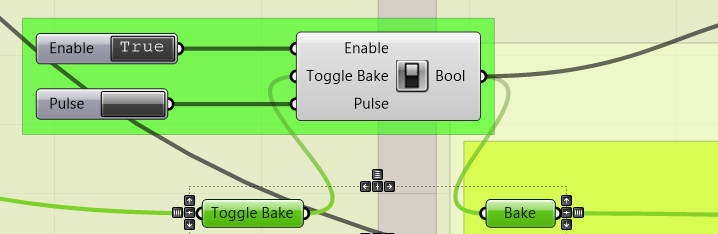
Notice the double functionality; #1: Enable/Disable the signal altogether, and #2: while the original signal is available but not currently sending its signal, I can still trigger locally a (bool) pulse by pressing the Button component.
Fig.4. This component consists of the following logic :
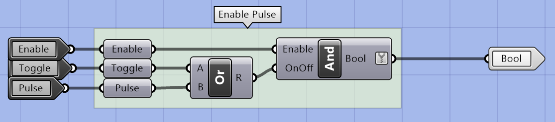
So why don’t I just use what I already have? Well I do use it, all the time, but the buttons are not included in a “cluster” component, and thus will not be dropped on the canvas together with the logic. And, dragging this thing around suffers from the problem related to position locking of the components - the whole group is easily messed up when dragging it around in order to have it “within reach” from the trouble-spot being tested.
So: A component to be desired is on which, when you drop it on the canvas, includes the buttons as well as the logic AND keeping the component group together as a whole when moving it around. It should have a regular Group area as a bottom plate as well, since that allows for different colors (for example making the group area glaringly red as to hint about local “tweaks” to be removed from the model when its tested and done). The buttons & the component should be position-locked to the local inner area of the group-area (see Wish #3 above) while allowing the area itself (the whole) being freely moved around.
.
[Edit: 2017-05-25, 06:46]
##(Fix) wish #7: Default Cursor Focus (Scribble)
Amazingly enough, the cursor focus when opening the Scribble dialog is not on the main idea with Scribble as a concept - the text.  Dropping the component on the canvas or even clicking a text to edit, does not(!) end up placing the cursor in default position in the text field of the dialog.

A 10 second fix? Or 5?
.
[Added: 2017-05-25,12:31 (UTC+1)]
##Wish #8: Lock Existence State
Prohibiting Rhino objects (including Gh components & groups) from being deleted (preserving the “existence state”) while allowing for “everything else”, like selecting and transforming etc.
Example use case where this makes very much sense is when creating “guide objects” (by baking or using pre-existing objects in Rhino template files) which the user is supposed to move around (but not delete) as to guide GH for where to perform its thing (in real-time or on user demand). As usual in UI situations, the risk is that the user accidentally deletes the guide objects which serves as input data for the GH logic, and the show would then disappointingly stop.
So, the ability to “LockFromDelete” or “PreventDelete” of objects would be gold in so many situations.
.
[Added: 2017-05-25,15:01 (UTC+1)]
##Wish #9: MarcusStrube Color Palette.
MarcusStrube’s Colors’ wish (which by mere coincidence is also my wish): A nice color scheme component.
Anyone using the existing color-thingy, trying to remember color codes, knows why this wish.
.
.
[Added: 2017-05-26, 04:00 (UTC+1)]
##Wish #10: Strube Input
Marcus Strube said (in a post here) what had to be said :
-
#.a … namely that Gh-component inputs should (optionally) display any entered constant values (Set Values) instead of only the input name.
-
#.b Double clicking on individual in-ports should toggle on/off the overlay/name-prefix info.
Marcus Strube’s illustration in Fig1 below demonstrates the idea. The value could be a “transparent overlay” or concatenated with the input name (Fig2) :
Fig.1. Transparent overlay of values - @MarcusStrube’s illustration shamelessly replicated here for your convenience :

Fig.2: Alternatively concatenated name+value pairs could be shown:
S:17
N:8
C:19
(The port names would still remain being S, N and C respectively).
.
.
[Added: 2017-05-27, 15:45 (UTC+1)]]
Wish #11: Named Views -> “Restore By Group” instead!
“Restore Named View” should include “Restore Group View”, in that a specific group is the target for the Named View.

-
Hit the target View - The “Named Views” feature in Gh is a good thing. Only problem is that it is based on a specific area of the canvas - only, and that area may (will, most probably) change during development, and so the intended target view is gone, or dislocated. If the target was identified by a Group instead, it is less likely that the view becomes useless, even if it would be moved far outside of the bounds it had when the View was defined. You will always hit the target of it is a Group that still exists.
-
By Name - Internally the target group could be identified by a GUID isntead of a name that may change.
-
(Re) Size : With a fixpoint in the upper left corner, the group will always be a valid target, although the size of the view may vary. But so can the Restored View (the Restored View can take on exactly the same size, or the same proportions as when defined, in both cases the likeliness of a useful Restoration of the View would be good).
-
UI surprise : That droopy eye UI-component is puzzling, even a bit surprising. It has the smaller tiny little click-target-area dedicated to the action which the user uses the most (although it requires higher precision, and thus is more tiring, to hit that little down-arrow at the side very often) while the big fat eye-area, which is used the least (for defining new Named Areas) is easy to hit, even without aiming. This is a school example of how to wear out the users. May I therefore I suggest to swap the areas so that the most frequently used click-area is the bigger one (the eye, that is).
.
.
Wish #12:
.
.
To be continued. 
// Rolf


