Cycles render set-up user experience

I’m currently involved in making a render setup for rendering in Cycles. For my own projects I’m used to setting things up in V-Ray, so that’s my reference as most of you know.

First impression is that everything is really slow, except for the rendering itself. The whole interface is slow (unworkable during rendering) but even without rendering it feels very sluggish.
The UI that I have to deal with is the material editor, and the post effects, render settings and tone map tabs.

The interface flickers when scrolling and sometimes doesn’t refresh properly until I pause the rendering. (render effects)

To make things clear, I am rendering on the CPU (dual 18 core xeon) only, so the graphics card should be free to deal with the UI. (M4000) and normally I don’t have any issues of lagging interface.

When switching to another rendering view/camera during a paused rendering, then unpausing will not refresh the render, I need to rotate the view to wake it up.

The material editor UI is…let’s put it mildly …horrible. I’m sorry to say this.
It’s probably due to the limitations of ETO (I have some first hand experience with how utterly difficult it is in there to get a nice layout), but everything looks ugly, it’s not a pleasure to work with at all. If you look at the current rendering engines out there that are quite popular it’s a step back in history, this feels like V-Ray 1.0 for Rhino from 10 years ago but worse.

Bump maps hardly work, normal maps a bit better. Bump maps look great in rendered view, but cycles seems to have no clue what to do with it.

Displacement mapping: same story. Even on a properly tesselated object, no matter how high I make the displacement, nothing happens.

Tone mapping is very limited, we need more control over the settings, for example the filmic one has only three steps. Medium is quite good, the other two are useless, at least in this project.

I didn’t find a sky model that adjusts its color with the position of the sun is this correct?

I tried to make a simple noise texture, but even just the texture takes literally minutes to generate, meanwhile giving me a spinning blue circle…I suspect it has to do with the fact that these procedural textures are generated over the objects the material is applied to, which seems to be a rendering preprocess on its own. Why does this take so much time? It is a lot faster when my view is in shaded mode (or at least other than rendering or raytraced, paused or not). But the process to distribute this over the model is unworkably slow, hence I cannot even consider using a procedural texture. It’s nice that this can be previewed in the model, but I’d rather have it as render only effect. At one point I just had to kill Rhino because it ended up being unresponsive.

When using a gradient as a sky, I get a lot of banding (look at the more or less horizontal banding and the more triangular ones best visible in the top part of this image:

I will update the list above once I am a bit further in the project, and continue to note things down what works and what not.

One more: viewCaptureToFile … generating preview takes way to long. Why? the view is already there.

2 Likes

Thank you for sharing your experiences as you are a professional render expert with V-Ray. I was thinking that I was using Rhino render in a wrong way as the interface is extremely slow for setting things up. I am curious about feedback from McNeel developers here.

Gijs

I’m afraid this is a wrong assumption. The UI is not drawn by the graphics card - it’s mainly CPU. If you are running your rendering on the CPU, I’m afraid there will be a significant impact on the rest of Rhino.

  • Andy

Could you be more specific about this? Are you talking about the lower panel? And in particular, which material type?

You need to use a Physical Sky texture as the texture in an environment.

Yes - this is a major problem which we are working on right now in Rhino 8

I assume this is in the viewport? If so - then yes, this is a known problem. It doesn’t exist in the render window.

are you using scene lighting or default lighting in rendered mode? i made the same observation but tracked it down at least in my case that the default lighting is way harder then any fancy light set up in which the bumps might be just softer.

1 Like

In that case: maybe you can ask Chaos how they solve it. I’m running Vray on CPU, and even when at 100% usage, they seem to make it possible to create no noticeable lag in the interface.

Ok, this is now clear, but not very obvious if you don’t know it. It would make more sense if this was an option, just like gradient and solid are options

One example:

The DOF icon is ugly, the star is ugly, the check boxes are ugly, the + icon is ugly, the slider is ugly, the hatch around the square is ugly, the white space around text on tabs is ugly… etc. etc…
Icons are not consistent, not across this UI and not with Rhino. The Open and save icons are quite nice, but different from Rhino, whereas the star / tone mapping / final pass icons are a different look and feel.
To me it looks like a graphic design that has been ruled by the tools at hand, instead of a graphic design that has been made and implemented.

Why the + and the x icons? They are redundant. Just list the available options and either enable or disable them instead of having to first add them and then enable or disable, and then the additional delete button.

More strange is when you add all available options of post effects, the + sign remains and clicking on it does not give any feedback that all options are taken
image

For the material interface, I will make a new write up tomorrow.

A few more things:

I have no clue what that Pick Area is supposed to do?
The Fog background seems to have no effect.

1 Like

addendum: even when I set cycles to 90% max CPU, still no difference whatsoever in the interface speed. As an example, you can try for yourself to adjust the sun while rendering. it’s sheer impossible.

Somehow you will need to make sure that cycles is always back in line, UI speed is far more important.

1 Like

Indeed, but the physical sky texture doesn’t have this issue, so at least that’s not really a problem anymore.

1 Like

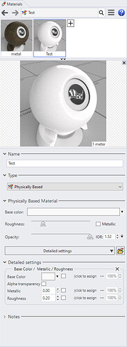
@andy Here’s my opinion on the material editor: As an example I’m taking the PBR, since that’s going to be the go-to material I think for the future. Of course we would better have a node based material system, but that’s another story.

Anyhow if I look at this:

The text in lower half Base Color and the little color icon, then the checkbox, then (click to assign then … then 100% spinner
I hardly know where to start, but imo it is a very unpleasant graphical composition. Text Base Color and (click to assign don’t line up (red line), the spinners are not the same height (purple lines), the white space is inconsistent (green lines), the check boxes don’t line up, everything is squarish but then the group border has rounded corners, the cross to close it has a background color that is just off from the rest of the background.
image

While using it I found a bug that if you change the base color, and delete the detailed settings, the base color gets reset to white.

If you assign a texture to a slot, you get a dialog, and by default it makes you browse for a bitmap, however all the other available textures are under a button at the bottom of the dialog reading:
“Choose from more texture types…”
I think this is confusing. Better give the texture dialog first that displays all options, especially the second time if you already assigned a non bitmap texture to a slot.

Another example is the texture dialog itself, I see no visual coherence in the design:

  • Some lines run to the color boxes and touch them, some run to the spinners and have a margin.
  • The checkboxes of the colors don’t line up well with swap colors

I think the design here for the color and possibility to assign a texture stacked on top of each other is a lot better than how you do it in the material dialog by the way.

  • Then suddenly Mapping channel text is lined out to the right.
  • Then there are the check boxes in the lower half, some align to the left, others to the middle.

I tried this again on a blank design and even there the preview of this procedural takes about 10 seconds to generate, so even without assigning to objects it is very slow. But do you mean this will not be fixed during this release?

1 Like

@andy
Some more findings after this afternoons session:
Let’s start with some good news:

  • Setting all camera , sun settings and post effect settings through Snapshots works well
  • Once set up renderings are pretty fast, the attached are couple of minute renderings.
  • Fog works well to blur out the horizon

Then some more points:

  • I noticed that setting the sun manually through the dialog gets very slow once it is linked to a physical sky. Hope this can get some attention, as it makes setting up a sun position almost impossible.

  • If you happen to have snapshots set to animate (in my case accidentally), then happy waiting blue spinning circle when switching to another view, especially if you are in Raytraced viewport mode. Imho Rhino should detect that it is not capable of changing the camera dynamically and just switch to the end state.

  • When a view is set to raytraced, changing to another view with snapshot doesn’t work correctly. Rhino will keep rendering, but the rendering doesn’t show up in the viewport.

  • I really miss a Color balance tool in post effects.

All in all, my conclusion after these two days is that there are quite a few points that need attention to make this work a bit more smoothly. It really feels I’m using early beta software, but the fact is that this is a released software in SR15.
I am allowed to send you this model for testing if that helps (not to be further disclosed). Then you can see for yourself how Rhino performs in this real world application.

2 Likes

I’ve gotten some good results by using home made layered PBR materials. The real issue I have is that mapping and modifying textures is horrible compared to other software. I also use a lot of decals and the lack of ability to cut and paste decals surface to surface is a big oversight.

Sketchup is stupid and limited but at least it gives you the option to easily make a unique instance of a texture and send it straight to photoshop to overpaint. It would be a great extension to help people’s renderings much better.

1 Like

Gijs

Please send the model to andy@mcneel.com. We will buggify everything you’ve written and see if we can improve things.

Andy

3 Likes

Thanks @andy I appreciate that. I will send the model this evening.

One more remark about the rendering user interface as a whole, is that it is very scattered around. There is the render settings in options, then the cycles options, the render settings in properties panel, the separate depth of field tab. The effects tab (that only shows up when setting a view to raytraced), the materials in properties, the separate materials dialog, the separate textures dialog. The sun/lights/environment dialog. The mapping setting dialog. Not sure if I missed a thing but it’s already a long list. For me as rendering expert I know what I need and what to look for but for the average user this must be very confusing.

6 Likes

I have to agree. This is the biggest problem in my opinion. If you’re doing renderings just a couple of times a year, it’s almost like starting over every time trying to find/remember the settings you need…

Philip

1 Like

Thank you Philip,
Yep, that’s also my experience as I hadn’t rendered for a while and therefore hired Gijs to do this job for me.

1 Like

Agreed here. I think Gijs did a great job outlining pain points but I agree that the interface is scattered. It’s a larger UX problem that’s hard to pin point in bug report style that is usually preferred on this forum. I try using rendered view every few months and I have no idea where to find anything, I keep flying through the render pane, the environment pane and the Rhino options window. At some point the entire UI becomes really slow with a Raytraced viewport at which point I give up, export and render elsewhere.

Ideally someone at McNeel could take a few days to map out the interactions between lighting, materials, render settings. How designers use them, how they’ve expect them to work and how the whole thing could be streamlined.

Hopefully I’m not overstepping here but this seems to be a weakness at McNeel where the expectations on how Rhino gets improved is by users giving very specific feedback on how they’d like things to work. This is fine for individual commands but falls short for larger UX problems like we’ve seen with Blocks, Layouts and now rendering. Now that we have a capable engine, we need a cockpit!

Some thoughts on simplifications that could work nicely is locking the environments, backdrop and lighting between Render, Raytraced and the offline render. I would guess that most users work between these three modes as a means of looking at their scene with different performance hits, not trying to set them up differently.

Consider renaming skylighting simply to environment. It took me a really long time to realize skylighting was where I’d stick an HDRI. Using a separate environment for reflections seems like a very niche thing that could be buried deeper. Tying with the point above, things would be much simpler if the environment pane simply has a single active environment across all rendered-style viewports. Maybe the backdrop setting is an attribute of the environment to simplify things further?

Viewport DPI scaling for Raytraced is basically a needed feature for anyone on a 4k screen. Loads of laptops have HiDPI screens but nowhere near the GPU power to run a live raytraced viewport. This setting should be accessible to everyone, not just nerds like us who lurk the forum.
image

Maybe it could even be put on the viewport? You keep the setting low while doing changes to the scene and then crank it up to get a clearer picture without having to do an actual render.
image

5 Likes

1 Like