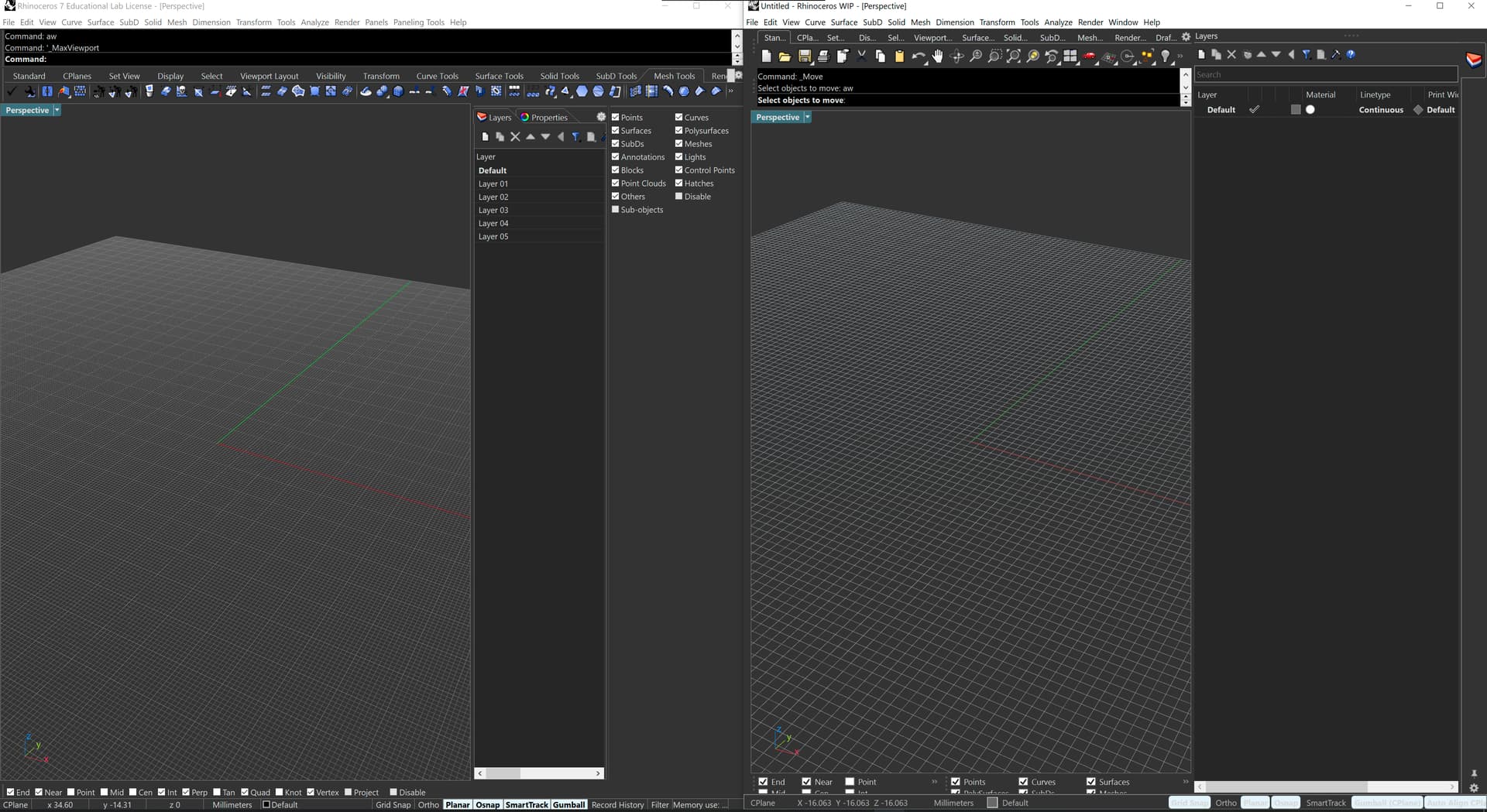
I have set up my UI to be dark mode and the bottom buttons for Osnap, the Gumball, etc. all become unreadable. They also take up a lot more space than in V7. Please make them smaller.
left is V7, right V8. The lower bar is indeed 3 pixels higher, is this what you mean? The effective viewport space however is bigger in V8 (6 pixels)
As for the bottom buttons, I suspect this has to do that yours is a custom color setup?
Can you play with these in Advanced Settings to see if that resolves your issue:
The text for the buttons should be dark, but that messes up all the colours elsewhere. Unless, I make the button enabled colour lighter, which is counter-intuitive to me. Though, I don’t see the option that controls the button enabled colour.